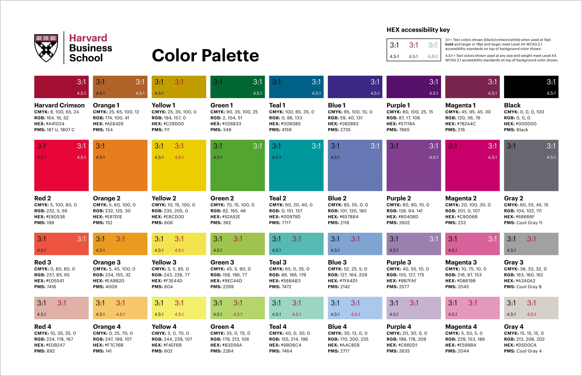
The text colors (black/crimson/white) shown on top of each swatch meet Level AA WCAG 2.1 accessibility standards for digital use when used on top of the background color shown. (When white is shown, type of this color will also work on a white background.) Please refer to the key in the top right corner of the PDF to determine acceptable type sizes and weights for accessibility. (Any other color combinations should be tested to confirm they meet the AA standard.)
Although these standards are specific to digital use, they can also serve as a general guide to inform acceptable text contrast for print materials.