Harvard Business School’s web design system introduces a flexible component library that supports modern, scalable, and accessible digital experiences on hbs.edu web properties while ensuring consistency of the HBS brand.
This page provides an overview of the web design system’s foundations: accessibility standards, the grid system, page templates, web color themes, and image aspect ratios.
Components are the primary expression of the design system. Pages can be constructed using one Topper and as many interchangeable Blocks as needed. Example pages demonstrate in-context component usage.
For questions about the web design system or a future web project, please contact Adam Dombovari in Marketing & Communications.
Accessibility
Harvard Business School is committed to creating accessible web experiences. All websites should follow Harvard University’s Digital Accessibility Policy to meet WCAG 2.1 Level AA standards. View accessibility resources and guidance for creating accessible PDFs.
Grid System
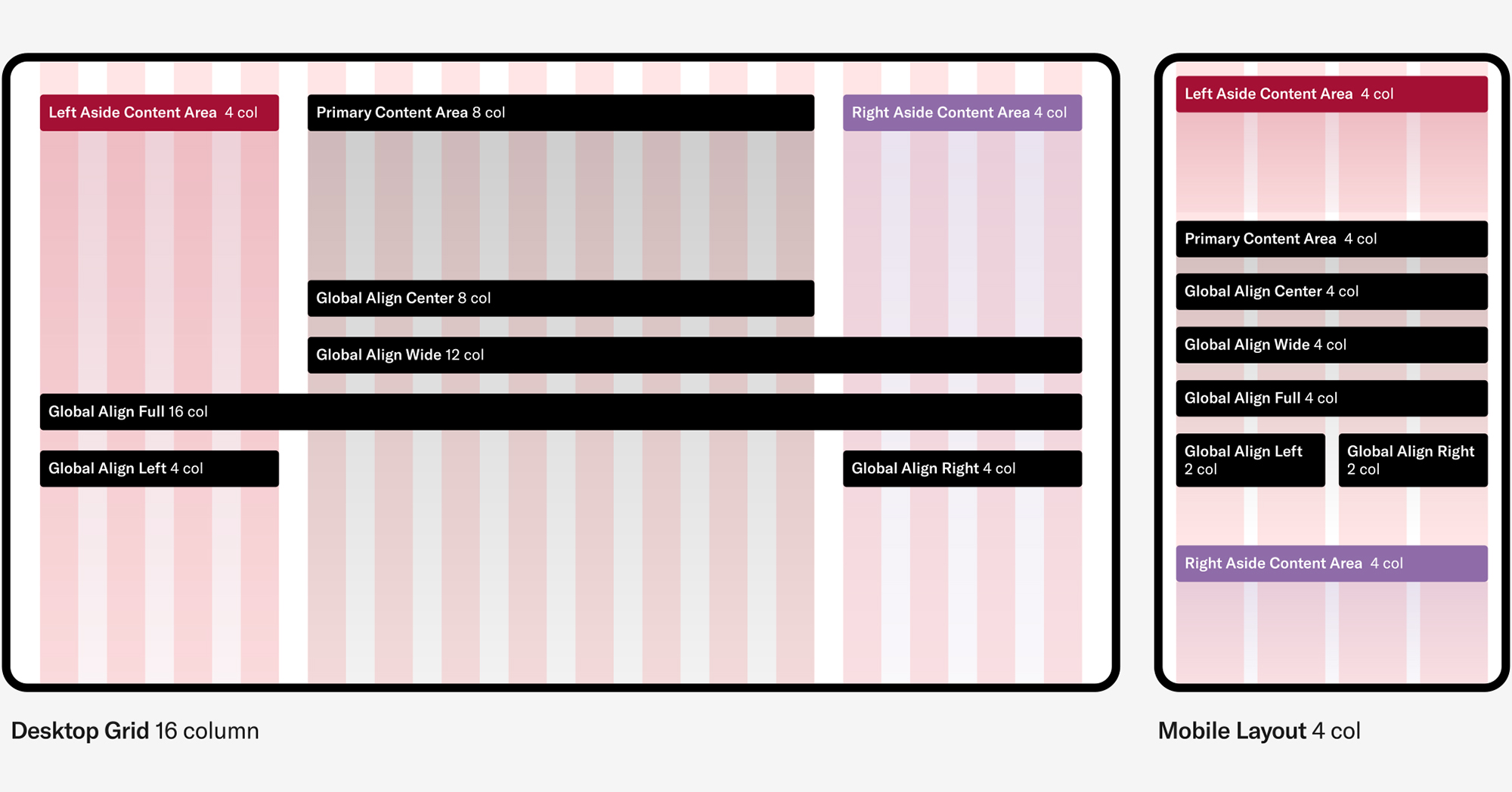
The web design system uses a responsive grid to create content columns, establish a vertical rhythm and ensure consistent alignments within pages and across the site. The grid consists of 16 columns on desktop and 4 columns on mobile. There are three basic content block alignment types: center (central 8 columns), wide (right 12 columns), and full (all 16 columns). View alignment options for each content block.
We use these breakpoints in the system to adjust layout or style for different viewport sizes:
$bp-mobile: 300px;
$bp-tablet: 600px;
$bp-tablet-xl: 800px;
$bp-desktop: 1024px;
$bp-desktop-lg: 1200px;
$bp-desktop-xl: 1440px;
The design system also utilizes fluid text styles that scale based on browser size.
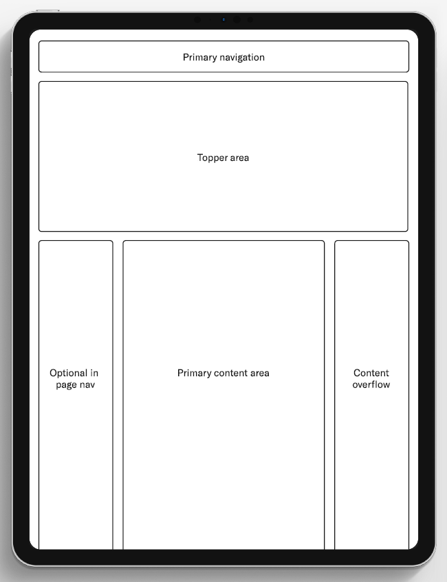
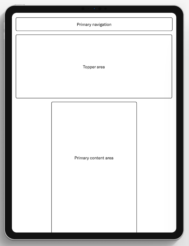
Page Templates
Most page templates share the same basic anatomy. The four template variations are supported by dozens of adaptable components that work across templates.
Detail Page Template
Detail Pages
Event Page
Profile Page
Course Page
People Listing
Landing Page Template
Fancy Landing Page
Simple Landing Page
Insights
Newsroom
Working Knowledge
Departmental Blogs

Content Template
Simple Article
Fancy Articles
Institutional News
Faceted Archive Template
Search
Editorial Archive
Program Finder

Web Color Themes
Color themes are provided in many Web Design System components.
-
Light
HEX: #F6F4F2
-
White
HEX: #FFFFFF
-
Dark
HEX: #222222
-
Black
HEX: #000000
-
Crimson
HEX: #A41034
-
Red
HEX: #E80538
-
Purple
HEX: #85609F
-
Blue
HEX: #AAC8EB
Fonts
Graphik is the only font that is part of Harvard Business School’s identity system. Complementary fonts should be used sparingly and with restraint and Graphik should always remain the dominant font in overall effect. Our standard Web designs use Tiempos as a complementary serif font. Harvard Business School owns a Web license for both HBS Graphik and Tiempos.
System fonts should be used only as a last resort when technical constraints dictate their use (such as in third-party applications). In cases where using Graphik is technically impossible, Arial should be used. (Cost should not be a factor in the decision of whether to use Graphik or a system font — Graphik should be used if technically possible.)
Image Aspect Ratios
There are four recommended aspect ratios used across the design system — 16:9, 3:2, 1:1 and 3:4.
- 3:2
This is the default horizontal crop. It is a bit more substantial than 16:9 but can take up too much vertical real-estate if the asset in the component is full width. - 16:9
A more compact horizontal crop. Use this if you want to reduce vertical scrolling on a page. (Inline-playing videos also use the standard 16:9 proportion.) - 1:1
A square crop only recommended for cropped headshots. - 3:4
This is the default portrait aspect ratio. Use for headshots and narrower asset treatments.
Component-Specific Guidelines
Recommended aspect ratios for each component that allow image use are provided below.
Toppers
| Component | Aspect Ratio (recommended) | Width (proportional) | Height (proportional) | Scaling Behavior |
|---|---|---|---|---|
| Card Topper | 3:2 | Fixed* (*Images will auto-crop based on the limiting dimension—see next section for details) | Fixed* | Scales down proportionately on mobile—does not crop. |
| Media Page Topper | 1 asset – 16:9 2 assets – 3:2 x 2 3 assets: 3:2, 3:4 & 3:2 | 1 asset – 16:9 Fixed 2 assets – 3:2 Fixed 3 assets – 3:4 Fixed; 3:2 Crops uniformly left and right | Fixed | 1 asset – Scales down proportionately on mobile—does not crop. 2 assets – Height is fixed; width will crop (uniformly left and right) on mobile. 3 assets – 3:4 images scale down proportionally – will not crop on mobile; 3:2 images height is fixed but width will crop (uniformly left and right) on mobile. |
| Split Page Topper | 3:4 | Crops uniformly left and right | Fixed | Height is fixed; width will crop (uniformly left and right) on mobile. |
| Statistics Page Topper | 3:2 | Crops uniformly left and right | Fixed | Height is fixed; width will crop (uniformly left and right) on mobile. Photo will go to square or slightly vertical on tablet and revert to horizontal on phone. |
| Split Article Topper | 3:4 | Crops uniformly left and right | Fixed | Height is fixed; width will crop (uniformly left and right) on mobile. Will appear horizontal on desktop, vertical on tablet, and square-ish to slightly vertical on phone. |
| Big Art Topper | 16:9 | Fixed* | Fixed* | Scales down proportionately on mobile—does not crop. |
| Profile Topper | 3:4 (See Notes) | Fixed* | Fixed* | 3:4 image will always crop top and bottom to just short of square (remains slightly vertical). Scales down proportionately on mobile—does not crop. |
Blocks
| Component | Aspect Ratio (recommended) | Width (proportional) | Height (proportional) | Scaling Behavior |
|---|---|---|---|---|
| CTA Banner | 1 asset – 3:2 2 assets (mismatched heights) – 3:4 & 3:2 2 assets (same heights) – 3:4 x 2 3 assets – 3:4 x 3 | 1 asset – 3:2 Fixed (Photo); 3:2 Not Fixed (Video)* 2 assets (mismatched heights) – Fixed* 2 assets (equal heights) – 3:4 (See Notes) 3 assets – 3:4 Crops uniformly left and right | 1 asset- 3:2 Fixed* 2 assets (mismatched heights) – Fixed* 2 assets (equal heights) – 3:4 (See Notes) 3 assets (See Notes) | 1 asset – Scales down proportionately on mobile—does not crop. 2 assets (mismatched heights) – Scales down proportionately on mobile—does not crop. 2 assets (equal heights) – As width first narrows, height is fixed and images crop left and right equally. At ~narrow tablet width, breaks to one (first) image and width is fixed and crops uniformly top and bottom. 3 assets – As width first narrows, height is fixed and images crop left and right equally. At ~tablet width, breaks to (first) two images: height is fixed and width crops uniformly left and right (slightly more width shows on left and right of images than in 3 image view.) At ~narrow tablet width, breaks to one (first) image: crops all sides – left and right uniformly; top and bottom uniformly. |
| Events Tease | 3:4 | Fixed* | Fixed* | Scales down proportionately on mobile—does not crop. |
| Grid List – Big | 3:4 | N/A | N/A | Scales proportionally down to tablet. No image on phone view. |
| Hero Statement | 3:2 | Fixed* | Fixed* | Text block covers increasing amount of lower-left section of image as browser width decreases. |
| Hero Tease | 3:2 | Fixed* | Fixed* | Text block covers increasing amount of lower-left section of image as browser width decreases. |
| Hierarchical Tease | 3:2 | Fixed* | Fixed* | Scales down proportionately on mobile. |
| Media Asset Row | Any | Fixed* | Fixed* | Scales down proportionally on mobile. |
| Media Carousel | 3:2 | Fixed* | Fixed* | Scales down proportionally on mobile. |
| Multiple Column List | 3:2 | Crops uniformly left and right | Fixed | Height is fixed; width will crop (uniformly left and right) on mobile. Image goes from horizontal to vertical appearance at narrow widths. |
| Quote Testimonial | 3:2 | Crops very slightly left and right (uniformly). | Fixed | Height is fixed. Width crops very slightly (uniformly) as browser narrows. |
| Section Intro Text | 3:4 or 4:3 (3:4 more ideal) | Fixed* | Fixed* | Scales down proportionately on mobile—does not crop. |
| Statistics Group | 3:2 | Crops uniformly left and right | Fixed | Height is fixed; width will crop (uniformly left and right) on mobile. Image goes from horizontal to vertical appearance on phone. |
| Supporting Details | 3:4 or 4:3 (3:4 more ideal) | Fixed* | Fixed* | Scales down proportionately on mobile—does not crop. |
| Tease Feed | 3:2 | Fixed* | Fixed* | Scales down proportionately on mobile—does not crop. |
| Tease Row – Article | 3:2 | Fixed* | Fixed* | Scales down proportionately on mobile—does not crop. |
| Tease Row – Content | 3:2 | Fixed* | Fixed* | Scales down proportionately on mobile—does not crop. |
| Tease Row – Person | 1:1 | Fixed* | Fixed* | Scales down proportionately on mobile—does not crop. |
| Tease Row – Book | Use original book cover aspect ratio for images. | Fixed* | Fixed* | Scales down proportionately on mobile—does not crop. |
| Timeline Tease | 3:2 | Fixed* | Fixed* | Scales down proportionately on mobile – does not crop. |
Template-Specific Singletons
| Component | Aspect Ratio (recommended) | Width (proportional) | Height (proportional) | Scaling Behavior |
|---|---|---|---|---|
| Article Footer | 1:1 | Fixed* | Fixed* | Crops to circular frame. |
| Related People | 1:1 | Fixed* | Fixed* | Crops to circular frame. |
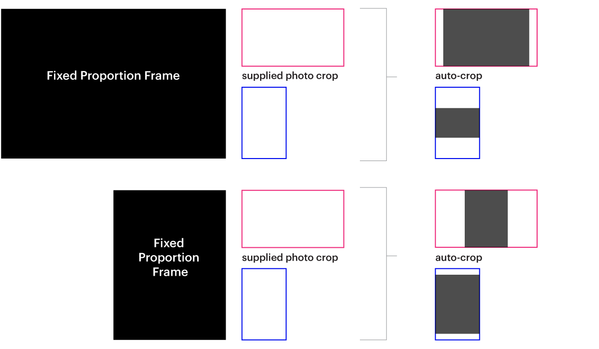
How Photos Auto-Crop in Fixed Proportion Footprints
In fixed proportion image footprints (i.e., both width and height scale down proportionally on mobile), the posted image will be auto-cropped based on the limiting dimension:
How to Use Storybook
We build, test, and document components for designers and developers in Storybook. Base variations show how components look in your browser and let you view the code. The control panel allows you to explore additional configuration options and component variations by adjusting the available variables (e.g., color theme, number of assets or teases, alignment, etc.).