HBS Graphik is a modern classic designed for maximum flexibility. With its clean geometric structure balanced with warm details, it is both highly legible and distinctly forward-looking.
These fonts are available to all Harvard Business School employees and the versions for use in Microsoft Office applications may be installed along with the Word letterhead template from the Marketing & Communications intranet (login required).
If you are a vendor doing contract work for the School, Graphik can be purchased here: commercialtype.com/catalog/graphik. Faces cost $50 apiece, so purchasing all 14 faces (which may not be necessary) would cost $700. (The only differences between these fonts and the customized “HBS Graphik” fonts are the widths of the capital letters H, B, and S in Graphik Regular, Medium, Semibold, and Bold which should not be a concern. Be sure to use the acronym mark when necessary.)
(If you are an internal graphic designer using Adobe applications, contact James Aris in Marketing & Communications for the appropriate version of the font.)
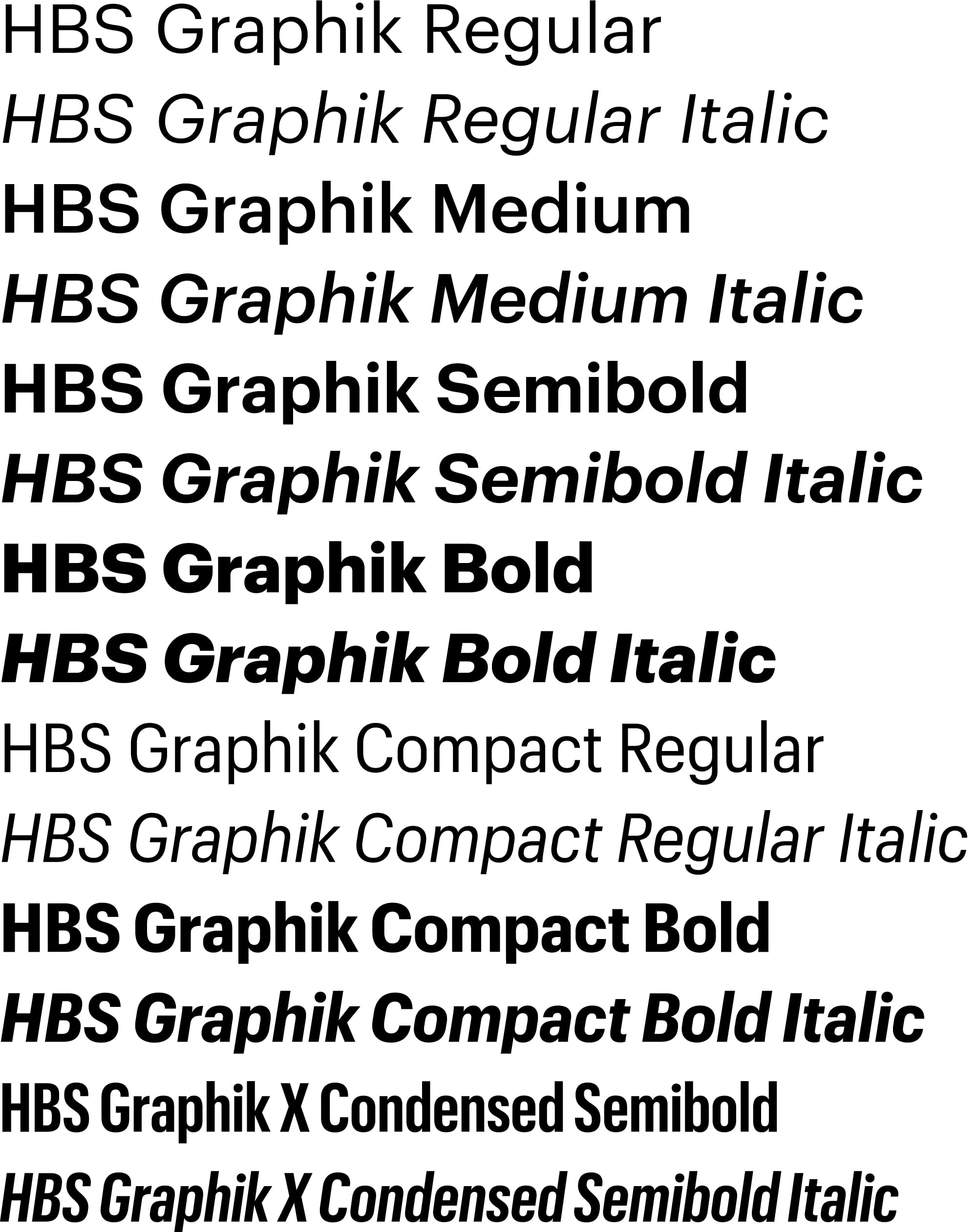
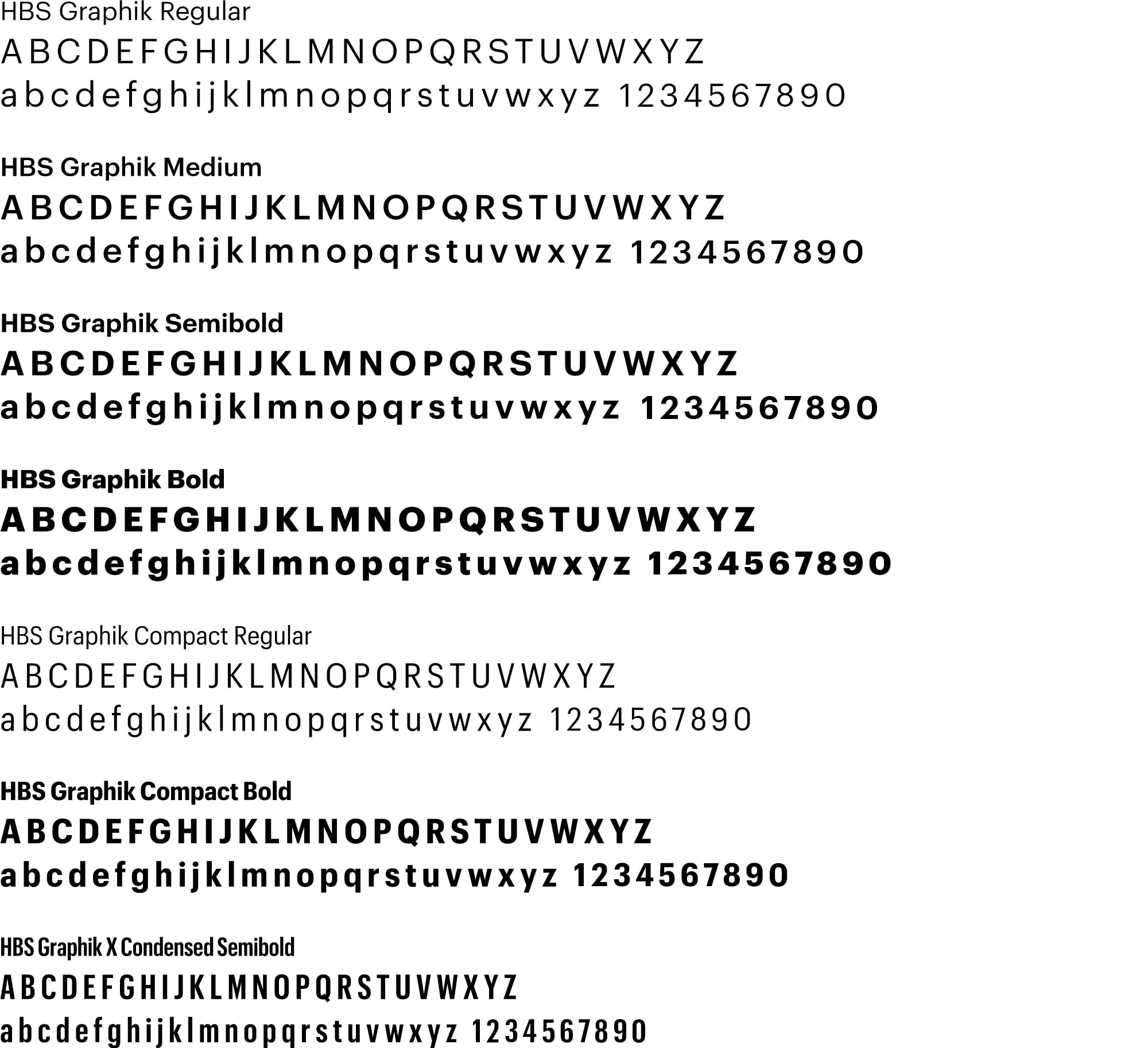
HBS Graphik Collection
With a rational grid composed of numerous weights and widths, the HBS Graphik Collection is created for maximum flexibility in communication.
HBS Graphik has been slightly customized—The width of the capital letters H, B, and S has been adjusted so that when stacked in the wordmark, they align left and right. This also makes those letters look more uniform when set in a sentence. This customization has been applied to four weights of HBS Graphik—Regular, Medium, Semibold, and Bold (not HBS Graphik Compact or HBS Graphik X-Condensed).
(Off-the-shelf Graphik may always be used in place of HBS Graphik if necessary.)
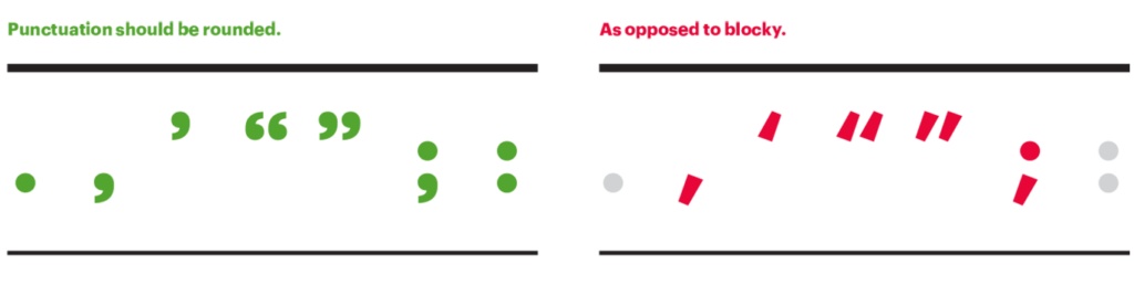
Punctuation Style
The default punctuation style in HBS Graphik is rounded (see below). If you are using an off-the-shelf version of Graphik, punctuation in display type should be changed to rounded if necessary (blocky is acceptable for body text if that is the default in your font version).
Utilizing HBS Graphik Styles
HBS Graphik Regular, Medium, Semibold, and Bold provide a solid groundwork for basic font usage. We recommend using HBS Graphik Compact to show contrast against regular text. Use it for sidebars, captions, or when horizontal space is limited and a narrower column is needed. HBS Graphik X-Condensed should primarily be used for headlines set in all-caps with a recommended 10% tracking.
There are additional styles and weights of the Graphik family that can be used to complement the HBS Graphik Collection, but they do not include the customizations listed above.
(Off-the-shelf Graphik may always be used in place of HBS Graphik if necessary.)

Complementary Fonts
Graphik is the only font that is part of Harvard Business School’s identity system. Complementary fonts should be used sparingly and with restraint and Graphik should always remain the dominant font in overall effect. There are no officially recommended complementary fonts but our standard Web designs (as shown here) use Tiempos.
System Fonts
System fonts should be used only as a last resort when technical constraints dictate their use (such as in email templates). In cases where using Graphik is technically impossible, Arial should be used. (Cost should not be a factor in the decision of whether to use Graphik or a system font — Graphik should be used if technically possible.)