Executive Education Color Palette
For Executive Education, we use a reserved set of colors for a more mature look. Our crimson-forward palette is supported with neutral colors that help to balance any layout. Below, you can see that red 2, 3 and 4, read as tints of crimson; and blue 1, 2, 3 and 4, supply cool tones to complement the warmer crimson and red. All are used sparingly as accent colors.
Colors for Backgrounds and Text (Including White)
-
Harvard Crimson
CMYK: 8/100/65/24
RGB: 164/16/52
HEX: #A41034
PMS: 187 U, 1807 C -
Red 2
CMYK: 5/100/80/0
RGB: 232/5/56
HEX: #E80538
PMS: 199 -
Blue 1
CMYK: 95/100/10/0
RGB: 59/40/131
HEX: #3B2883
PMS: 2735 -
Blue 2
CMYK: 65/55/0/0
RGB: 101/120/180
HEX: #6578B4
PMS: 2116 -
Black
CMYK: 0/0/0/100
RGB: 0/0/0
HEX: #000000
PMS: Black -
Gray 2
CMYK: 60/55/45/15
RGB: 104/102/111
HEX: #68666F
PMS: Cool Gray 11
Colors for Backgrounds, Charts and Graphics
-
Red 3
CMYK: 0/80/80/0
RGB: 237/85/65
HEX: #ED5541
PMS: 7416 -
Red 4
CMYK: 10/35/25/0
RGB: 224/178/167
HEX: #E0B2A7
PMS: 692 -
Blue 3
CMYK: 52/25/5/0
RGB: 127/164/209
HEX: #7FA4D1
PMS: 2142 -
Blue 4
CMYK: 30/13/0/0
RGB: 170/200/235
HEX: #AAC8EB
PMS: 2717 -
Gray 4
CMYK: 15/15/15/0
RGB: 213/208/202
HEX: #D5D0CA
PMS: Cool Gray 4 -
White
CMYK: 0/0/0/0
RGB: 255/255/255
HEX: #FFFFFF
PMS: White
Accessibility – Color and Contrast
Harvard University uses The Worldwide Web Consortium’s Web Content Accessibility Guidelines version 2.1, Level AA Conformance (WCAG 2.1 Level AA) as our conformance standards.
You can read the full accessibility policy here:
https://accessibility.huit.harvard.edu/digital-accessibility-policy
Accessibility – Font on Background Color
| AAA (Contrast = 7+) | AA (Contrast = 4.5+) | AA18 (Contrast = 3+) |
|---|---|---|
| Text color can be used at: Text at any size. | Text color can be used at: Text at any size | Text color can be used at: Bold text at 14pt and larger. Text at 18pt and larger. |
The text colors shown on top of each swatch below meet Level AA WCAG 2.1 accessibility standards for digital use when used on top of the background color shown. Any other color combinations should be tested to confirm they meet the AA standard.
The Harvard Digital Accessibility website provides this color contrast checking tool:
https://www.tpgi.com/color-contrast-checker/
NOTE: Although these standards are specific to digital use, they can also serve as a general guide to inform acceptable text contrast for print materials.
Font Colors – White Background
White
CMYK: 0/0/0/0
RGB: 255/255/255
HEX: #FFFFFF
PMS: White
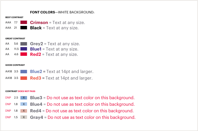
Best Contrast
| Contrast | Color Hex Value | Guidance |
|---|---|---|
| AAA 7.7 | #A41034 | Crimson = Text at any size. |
| AAA 21 | #000000 | Black = Text at any size. |
Great Contrast
| Contrast | Color Hex Value | Guidance |
|---|---|---|
| AA 5.6 | #68666F | Gray 2 = Text at any size. |
| AA 11.5 | #3B2883 | Blue 1 = Text at any size. |
| AA 4.6 | #E80538 | Red 2 = Text at any size. |
Good Contrast
| Contrast | Color Hex Value | Guidance |
|---|---|---|
| AA18 3.5 | #6578B4 | Blue 2 – Text at 14pt and larger. |
| AA18 3.5 | #ED5541 | Red 3 – Text at 14pt and larger. |
Contrast Does Not Pass
| Contrast | Color Hex Value | Guidance |
|---|---|---|
| DNP 2.5 | #7FA4D1 | Blue 3 – Do not use as text color on this background. |
| DNP 1.8 | #AAC8EB | Blue 4 – Do not use as text color on this background. |
| DNP 1.8 | #E0B2A7 | Red 4 – Do not use as text color on this background. |
| DNP 1.5 | #D5D0CA | Gray 4 – Do not use as text color on this background. |
Font Colors – Harvard Crimson Background
Harvard Crimson
CMYK: 8/100/65/24
RGB: 164/16/52
HEX: #A41034
PMS: 187 U, 1807 C
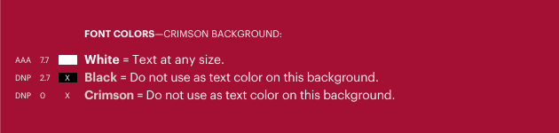
| Contrast | Color Hex Value | Guidance |
|---|---|---|
| AAA 7.7 | #FFFFFF | White = Text at any size. |
| DNP 2.7 | #000000 | Black = Do not use as text color on this background. |
| DNP 0 | #A41034 | Crimson = Do not use as text color on this background. |
Font Colors – Red 2 Background
Red 2
CMYK: 5/100/80/0
RGB: 232/5/56
HEX: #E80538
PMS: 199
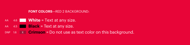
| Contrast | Color Hex Value | Guidance |
|---|---|---|
| AA 4.6 | #FFFFFF | White – Text at any size. |
| AA 4.5 | #000000 | Black = Text at any size. |
| DNP 1.6 | #A41034 | Crimson = Do not use as text color on this background. |
Font Colors – Red 3 Background
Red 3
CMYK: 0/80/80/0
RGB: 237/85/65
HEX: #ED5541
PMS: 7416
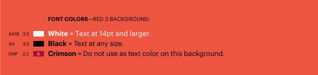
| Contrast | Color Hex Value | Guidance |
|---|---|---|
| AA18 3.5 | #FFFFFF | White = Text at 14pt and larger. |
| AA 4.5 | #000000 | Black = Text at any size. |
| DNP 2.2 | #A41034 | Crimson = Do not use as text color on this background. |
Font Colors – Red 4 Background
Red 4
CMYK: 10/35/25/0
RGB: 224/178/167
HEX: #E0B2A7
PMS: 692
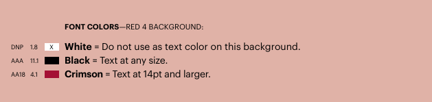
| Contrast | Color Hex Value | Guidance |
|---|---|---|
| DNP 1.8 | #FFFFFF | White = Do not use as text color on this background. |
| AAA 11.1 | #000000 | Black = Text at any size. |
| AA18 4.1 | #A41034 | Crimson = Text at 14pt or larger. |
Font Colors – Blue 1 Background
Blue 1
CMYK: 95/100/10/0
RGB: 59/40/131
HEX: #3B2883
PMS: 2735
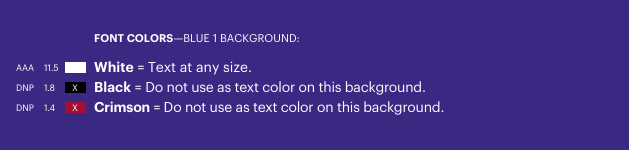
| Contrast | Color Hex Value | Guidance |
|---|---|---|
| AAA 11.5 | #FFFFFF | White = Text at any size. |
| DNP 1.8 | #000000 | Black = Do not use as text color on this background. |
| DNP 1.4 | #A41034 | Crimson = Do not use as text color on this background. |
Font Colors – Blue 2 Background
Blue 2
CMYK: 65/55/0/0
RGB: 101/120/180
HEX: #6578B4
PMS: 2116
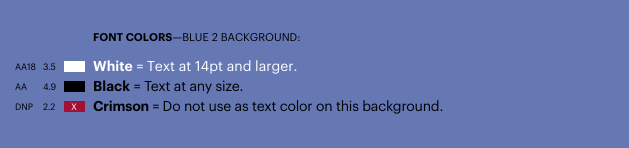
| Contrast | Color Hex Value | Guidance |
|---|---|---|
| AA18 3.5 | #FFFFFF | White = Text at 14pt and larger. |
| AA 4.9 | #000000 | Black = Text at any size. |
| DNP 2.2 | #A41034 | Crimson = Do not use as text color on this background. |
Font Colors – Blue 3 Background
Blue 3
CMYK: 52/25/5/0
RGB: 127/164/209
HEX: #7FA4D1
PMS: 2142
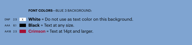
| Contrast | Color Hex Value | Guidance |
|---|---|---|
| DNP 2.5 | #FFFFFF | White = Do not use as text color on this background. |
| AAA 8.1 | #000000 | Black = Text at any size. |
| AA18 2.5 | #A41034 | Crimson = Text at 14pt and larger. |
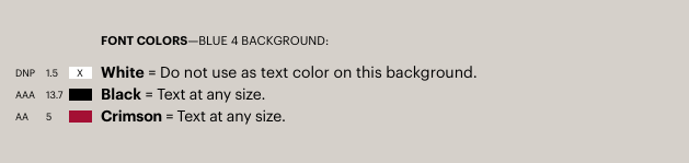
Font Colors – Blue 4 Background
Blue 4
CMYK: 30/13/0/0
RGB: 170/200/235
HEX: #AAC8EB
PMS: 2717
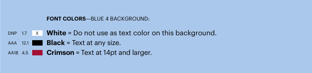
| Contrast | Color Hex Value | Guidance |
|---|---|---|
| DNP 1.7 | #FFFFFF | White = Do not use as text color on this background. |
| AAA 12.1 | #000000 | Black = Text at any size. |
| AA18 4.5 | #A41034 | Crimson = Text at 14pt and larger. |
Font Colors – Black Background
Black
CMYK: 0/0/0/100
RGB: 0/0/0
HEX: #000000
PMS: Black
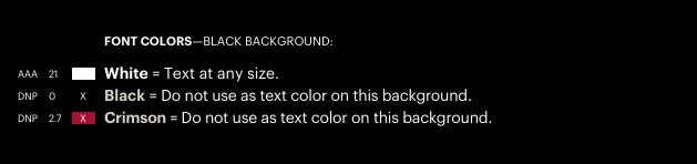
| Contrast | Color Hex Value | Guidance |
|---|---|---|
| AAA 21 | #FFFFFF | White = Text at any size. |
| DNP 0 | #000000 | Black = Do not use as text color on this background. |
| DNP 2.7 | #A41034 | Crimson = Do not use as text color on this background. |
Font Colors – Gray 2 Background
Gray 2
CMYK: 60/55/45/15
RGB: 104/102/111
HEX: #68666F
PMS: Cool Gray 11
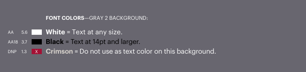
| Contrast | Color Hex Value | Guidance |
|---|---|---|
| AA 5.6 | #FFFFFF | White = Text at any size. |
| AA18 3.7 | #000000 | Black = Text at 14pt and larger. |
| DNP 1.3 | #A41034 | Crimson = Do not use as text color on this background. |
Font Colors – Gray 4 Background
Gray 4
CMYK: 15/15/15/0
RGB: 213/208/202
HEX: #D5D0CA
PMS: Cool Gray 4
| Contrast | Color Hex Value | Guidance |
|---|---|---|
| DNP 1.5 | #FFFFFF | White = Do not use as text color on this background. |
| AAA 13.7 | #000000 | Black = Text at any size. |
| AA 5 | #A41034 | Crimson = Text at any size. |
Background Color Rules – General
The HBS brand colors white and crimson, are the primary recommendations for backgrounds in any media.
The background colors for advertising and/or organic social creative are subject to change from time to time. Regularly refreshing our ads to combat creative fatigue requires the use of various background colors over time (in compliance with accessibility).
Background Color – Social
Paid Social: Crimson Background

Organic Social: White Background

Background Color – Banners
Brand + Retargeting + CLPs: Crimson Background


Focused Programs + Categories: White Background


Background Color – All Media
In order to create levels of information hierarchy, it is often necessary to add a background color. This is true for all media–brochures, website, emails, social posts, etc.
In these examples, the background colors white, blue, crimson and black are used to provide three levels of differentiation within information-rich pages.
As with all instances of text on color, it is imperative that accessibility is assured. As such, the HBS Blue 4 that is used in these examples is rendered in a tint; preferably 20% (never greater than 20%, and never lesser than 10%).