Executive Education Design System
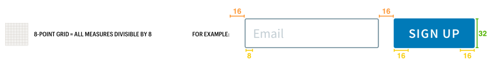
8-Point Grid
Consistent, and scalable spacing helps eliminate guesswork whilst designing and developing. It requires fewer design decisions. And it enables a much faster turnaround on projects.
The 8pt Grid is probably one of the most commonly used Layout Grid Systems there is, and for very good reason.
HBS Digital and Print Layouts Adhere to an 8-Point Grid for Consistent and Scalable Spacing
This system uses multiples of 8 to define dimensions, padding, and margin of elements.
What is the value of the 8-pt system?
For Designers: Efficiency, less decisions to make while maintaining a quality rhythm between your elements.
For Teams: An easy system of communication between designers and developers (no fussing over pixels).
A developer can easily eyeball an 8pt increment instead of having to measure each time.
For Users: Consistent aesthetic to the brand they trust. No blurry half-pixel offsets on their preferred device.
For HBS: Easy, even, consistent results (in less time) with greater multi-platform compatibility.
Calls-To-Action (CTA)
A Harvard Business School CTA, such as buttons (ie, emails) and outbound links (ie, PDFs of print pieces), should stand out and be instantly recognizable for the action that it represents.
Buttons
Primarily used in emails, buttons are intended to stand out and promote users to the next level of interaction.
- In emails, use Arial Bold (otherwise, use Graphik Semibold)
- Primarily use HBS crimson, black, or white (depending on situation)

8-Point Grid = All measures are divisible by 8
Above/Below Text: 16-point
Left/Right Text: 32-point
Links
Across all digital media, text-based links are used extensively and as such need to be consistently styled.
- Primarily use HBS crimson, black, or white (depending on situation)
- In emails, hyperlinked copy is underlined rather than bolded.
- On the website, hyperlinked copy is underlined and bolded.
- Use Graphik Semibold
- Within copy blocks, if the link is on its own line, use the outbound link icon.

When showing full link information, the outbound link icon is not necessary.

It is acceptable to use HBS colors for icons to make distinctions between offerings. However, for accessibility, the icon set cannot be differentiated solely by color. They MUST have visual differences in their form.
Underlining Link is Optional
It is acceptable to just make the link Graphik Semibold (or Arial Bold, depending on the situation).
Digital Accessibility
Harvard University is committed to making University Information Technology and University Digital Content accessible.
- The Digital Accessibility Policy [https://accessibility.huit.harvard.edu/digital-accessibility-policy] is established to promote equal access to information technology and digital content and to improve the user experience of IT and digital/online media for all users, including persons with disabilities.
- Guidelines and extensive resources are available on the Harvard University Digital Accessibility website [https://accessibility.huit.harvard.edu/].
Accessible Documents
Harvard University mandates that all documents distributed via email or online meet these accessibility standards:
https://accessibility.huit.harvard.edu/digital-accessibility-policy.
- When creating InDesign files, designers should follow specific rules that make the content accessible.
- Once files are approved, there is a process in place for remediation (eliminating accessibility barriers). Either the InDesign file or the PDF must be remediated before an asset can be released.
Imagery Style and Usage
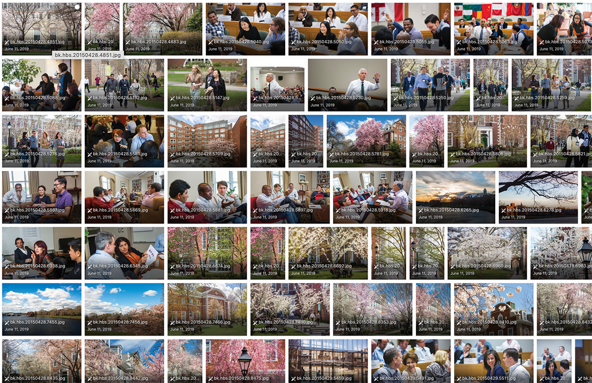
Harvard Business School has developed an extensive library of images to use across all formats and deliverables. This library should be the first source to reference and should be considered the primary source for imagery.
All imagery should be rendered in full-color (no black and white, monotone, duotone, etc).


The HBS ExEd M&S Photo Library
https://hbs.sharepoint.com/sites/exedmsphotography/Shared%20Documents/Forms/AllItems.aspx
(Link requires HBS login)
As your primary source for imagery, this extensive collection contains a vast array of photography; from exterior architecture to classroom settings and student-focused scenarios.
NOTE: A Large number of these images will require a level of touching-up.
- Name cards need to be blurred (to obscure legibility)
- Cups / bottles should be removed (if possible)
- Color-correction may be necessary (interiors especially)

Stock Photography
Stock imagery can be used in select situations when photos of our programs, participants, faculty, and campus don’t effectively fulfill the need. Examples of appropriate stock imagery use include marketing materials for virtual-only programs, in Executive Insights and other white paper style materials, and in email newsletters that feature thought leadership articles from HBR, Working Knowledge, and other similar sources.
Because of the range of our applications, we highly prefer stock images be purchased with full privileges of use in all situations (print, digital, etc) and without additional fees.
Visual support for HBS’ editorial deliverables (ie, Executive Insights) typically need imagery that supports a concept, and is one of the only places that require a more graphic, or illustrative, image approach.
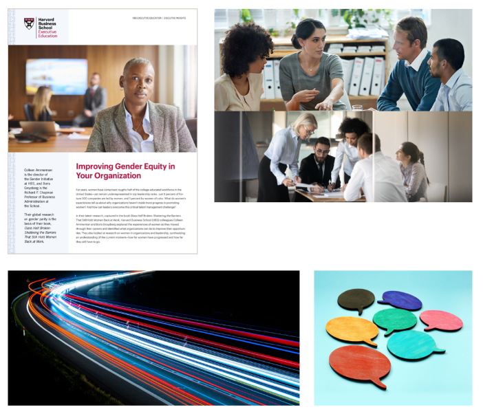
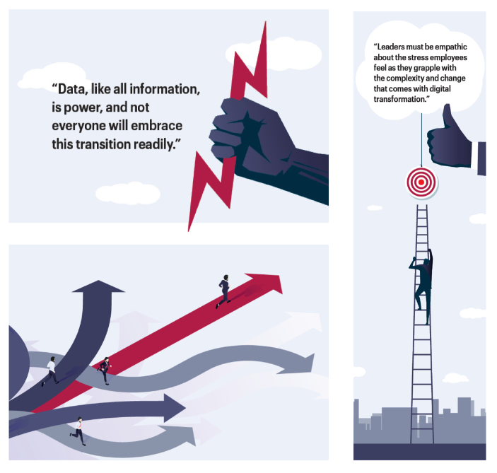
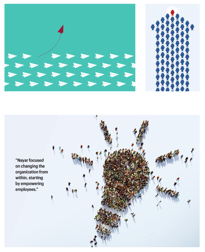
Illustration Style and Usage
Much like Stock photography, the use of illustration is necessary for use in situations that require the conveyance of specific concepts that are not achievable with photographic imagery.
All illustrations should be chosen for their simplicity and effectiveness to convey the concept at hand.
In situations where there are a collection of multiple articles, it is necessary that the illustration style and color remains consistent within each article. That said, like an editorial piece, each article should be treated individually and given its own illustrative treatment.
If time allows, the colors used in the illustration should be modified to use colors from the HBS color palette; for instance, re-coloring the signature element of the illustration.
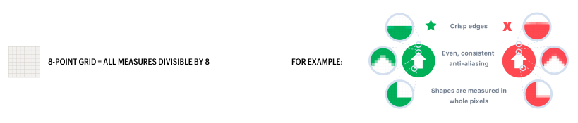
Icon Style
Icons Are Used Sparingly. When icons are used, they should be kept very simple, and preferably line-based.
When more contrast is required, contain the icon within a container (ie, circle, rounded square, etc).
Shape should be the primary differentiator between icons in a set. For accessibility reasons, it’s important to understand that color alone cannot be the only way to distinguish between two icons that need to convey distinct meanings.
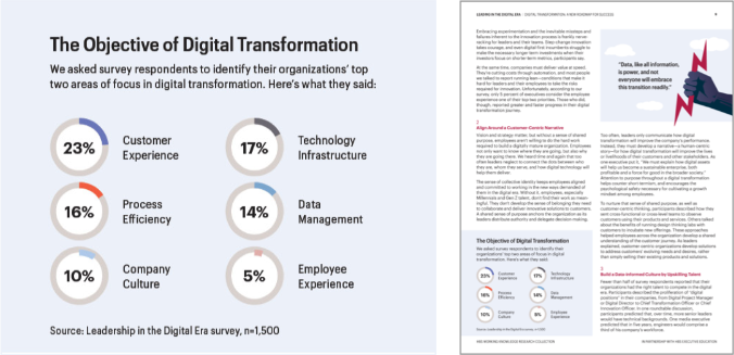
Data / Charts / Tables – Style and Usage
The general rule regarding HBS information design is “keep it simple, minimal, clean and timeless.”
In most instances, the amount of text the illustration is supporting is quite dense, so there is a need to use condensed and/or compressed fonts to fit all of the data within the restricted space.
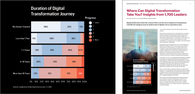
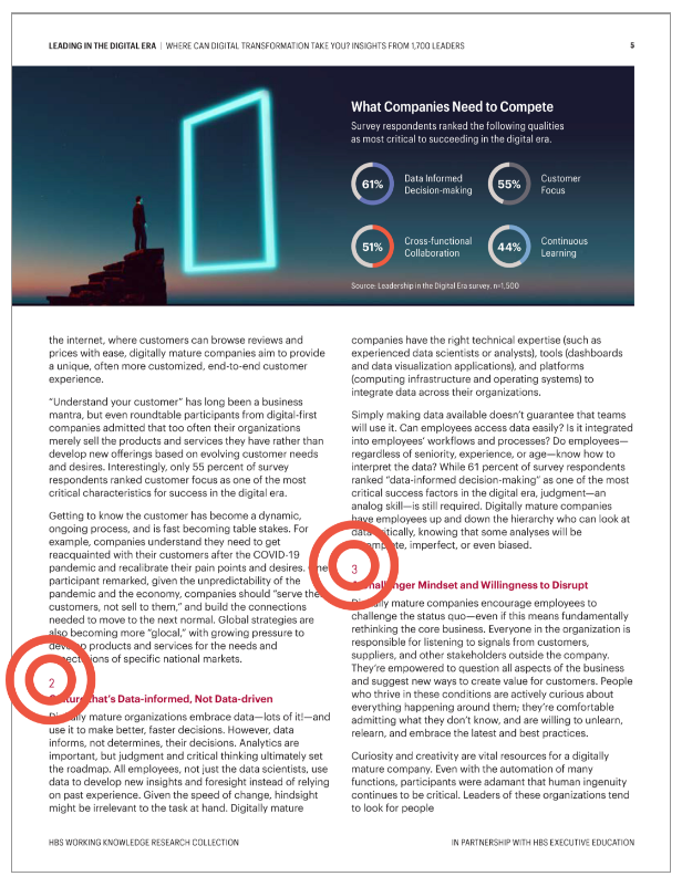
Keeping text large and legible can create a technical challenge; this one shows the difficulty of fitting all the information on the page. Simple lines can help to connect text to the graphic and make for a simple, but eye-catching graphic element.
To ensure readability and graphic impact, using a ‘doughnut’ pie chart style can make a big difference.
Powerpoint pages often have an abundance of information to represent. For this reason, simplicity in form and color helps to keep the page organized and understandable.

Tables require a simple organization of a large amount of information. This again is an example of how a simple palette can provide a clean platform to showcase the information hierarchy of the piece.
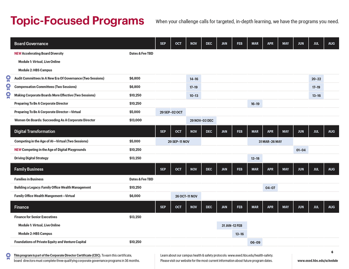
Calendar tables can convey a lot of information and still remain simple and elegant.
Number Usage
All numbers used in text should be rendered without a leading zero (ie, “1” not “01”).
The only exception to this rule is the treatment of dates, which requires a specific Day/Month/Year format: DD MMM YYYY. (See the Typography page for more information.)
The preferred location for page numbers (rendered without a leading zero) is to the right side of the page. The orientation of the document determines whether it is at the top or at the bottom.
Never place page number on top of the pattern (to ensure ADA compliance).
Horizontal Layout = Lower Right
Vertical Layout = Upper Right
An exception to the page number positioning is in PowerPoint, which uses the right side for our logo and brand imagery. In this case, the only position possible is to the left.
PowerPoint = Lower Left
Logo Animation (Motion Graphics)
Entitled “Educated Extraction,” the preferred animation style of introducing the HBS logo does so in the following manner:
Like an eye opening, the center rule of the HBS logo is revealed from the center of the screen.
Simultaneously, from the center rule:
A) The HBS Shield wipes left, while B) The HBS Wordmark wipes right
Quickly and efficiently, the HBS logo is revealed in its entirety.