Executive Education Logo Guidelines
The new HBS brand system includes a new primary logo composed of a modern wordmark locked up with the established shield.
The vertical wordmark extension is the preferred version and should be the standard usage when space allows.
We recommend maintaining a minimum clear space defined as 2x the width of the “H” in Harvard in the wordmark around all logos in the system.
The horizontal wordmark extension should only be used in cases when space constraints make using the vertical wordmark extension too difficult.
Vertical Logo (preferred)

Horizontal Logo
Only use the horizontal logo after all attempts to use the vertical version have proven unsuccessful.

Four Color Variations
The primary logo in the top left is the preferred logo and should be used most often. It can be used on white and other light backgrounds that provide adequate contrast.
The 1-color logo (top right) may appear in any palette color as long as there is significant contrast against the background.
When using the 1-color logo or any of the reversed or white knockout logos, all the text should be the same color, and the pipe should match the color of the text.

Minimum Size
Minimum Logo Size = 50 Pixel Height
Because of the complexity of the shield illustration, the full logo (shield + wordmark), should not be rendered smaller than what is shown below.
The example shown is a 300 x 250 web banner depicting the minimum logo size.
Logo size is dependent on the dimensions of the asset where it is being used. Templates have all assets sized properly. Otherwise, visually balance the logo size to the examples provided in this document.

Improper Usage in Layout
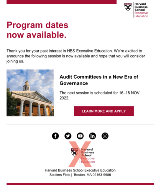
Show Only One Shield at a Time
The full, illustrated shield in the logo can only be used once per layout (ie, any page, banner, social image, email, etc.).
Note: Since the shield pattern only uses a simple, graphic outline of the shield shape, the shield pattern is considered a graphic element and as such is perfectly acceptable to use with the shield/logo.
For example, in the email shown below, it is not acceptable to use two logos in a single layout (here shown at the top and the bottom).
