Identity System
The identity system includes a primary logo composed of a modern wordmark locked up with the long-established shield. Wordmark extension options and an HBS acronym mark are also part of the system.
Do not alter, recreate, or redraw the logos.
The images on this page are for reference only. Request image files for use from the following sources:
Requests by alumni
Requests by alumni should be sent to Alumni Marketing & Communications.
Requests by MBA students
Requests by MBA students should be sent to MBA Clubs.
Executive Education requests
Executive Education requests should be sent to your program manager. Requests by staff should be sent to Executive Education Marketing. (Alumni are not permitted to use Harvard Business School logos for any use including gifts, event materials, clothing, print and digital materials, etc., for their own non-School-sanctioned events.)
HBS Online requests
Past participants are not permitted to use Harvard Business School logos for any use, including event materials, gifts, and print and digital materials for their non-HBS Online-sanctioned events.
All other requests
Files can be provided by James Aris in Marketing & Communications.
Primary Logo


The primary logo pairs the shield with a wordmark set in a customized version of HBS Graphik.
An official mark containing the name of the School must appear on all materials intended for external audiences when space allows.
When the shield is locked up with the name of the School, it must always appear to the left of the rule and wordmark, and the relative size and position should match the sample shown and should not be changed.
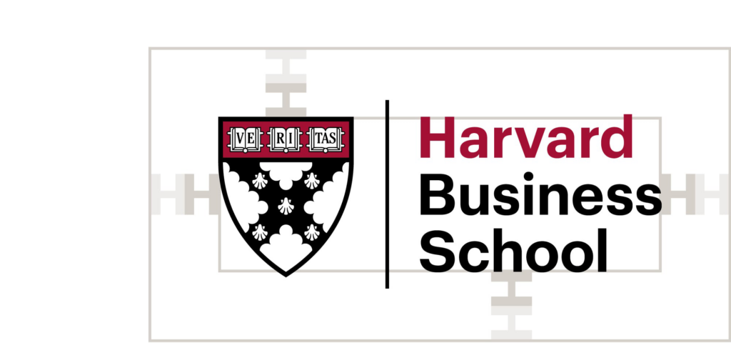
We recommend maintaining a minimum clear space defined as 2x the width of the “H” in Harvard in the wordmark around all logos in the system.
Only one Harvard Business School wordmark (i.e., one shield) may appear on a piece, so avoid using the shield as a recurring design element.
Shield & Logo Color Variations

The primary logo in the top left is the preferred logo and should be used most often. It can be used on white and other light backgrounds that provide adequate contrast.
The 1-color logo (top right) may appear in any palette color as long as there is significant contrast against the background, but it most often appears in black, crimson, or fully knocked out to white (bottom right).
When using the 1-color logo or any of the reversed or white knockout logos, all the text should be the same color, and the pipe should match the color of the text.
There are seven shield and logo variations.
Four for use on white and other light backgrounds:
- Crimson + black shield (“Harvard” in crimson)
- Crimson + black shield (black text)
- Black shield (white fill)
- Black shield (transparent)
Three for use on black and other dark backgrounds:
- Reversed crimson + black shield
- Reversed black shield (black fill)
- White knockout shield
Vertical Wordmark Extension (Preferred)

The vertical wordmark extension is the preferred version and should be the standard usage when space allows. Primary academic programs use the larger signature style (above left), and all other signatures or logos with multiple signatures use the smaller style (above right).
Logos using the larger signature style are set in HBS Graphik Regular 90.25/90 pt with metrics kerning and -10 tracking. Logos using the smaller signature style are set in HBS Graphik Medium 56.5/59.5 pt with metrics kerning and 0 tracking.
Preferred colorway: Harvard Business School in black, department/program in crimson.
Alternate colorways: Harvard Business School and department/program in all black or knocked out to white.
Only one shield should appear on a piece, so if multiple departments need to be included, they should be listed separately from the Harvard Business School wordmark (i.e., the wordmark extension should not be used).
Horizontal Wordmark Extension

The horizontal wordmark extension should only be used in cases when space constraints make using the vertical wordmark extension difficult.
Preferred colorway: Harvard Business School in black, department/program in crimson.
Alternate colorways: Harvard Business School and department/program in all black or knocked out to white.
Only one shield should appear on a piece, so if multiple departments need to be included, they should be listed separately from the Harvard Business School wordmark (i.e., the wordmark extension should not be used).
Wordmark Without Shield

In rare cases, when the shield is used as a prominent design element, the rule and wordmark may appear without being locked-up with the shield. (An example is shown above.) When used in this way, specific permission must first be granted by Marketing & Communications.
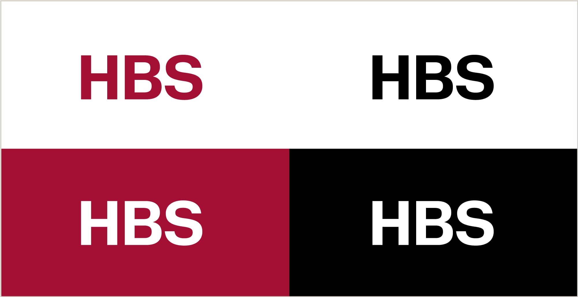
Acronym Mark

The primary logo is preferred to the acronym except when space constraints make using the primary logo impossible. Under normal circumstances, the acronym marks alone are insufficient identifiers of the School.
There are two exceptions to this rule:
- Swag items (primary logo and acronym are equally acceptable),
- Campus signage (primary logo is preferred but the acronym is acceptable)