Executive Education Typography Guidelines
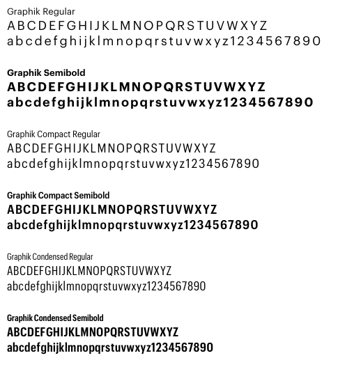
The new logo pairs the shield with a wordmark set in a customized version of the font Graphik. With a rational grid composed of numerous weights and widths, Graphik is created for maximum flexibility in communication.
If you are a vendor doing contract work for the School, Graphik can be purchased at a cost $50 apiece, so purchasing all 12 faces (which may not be necessary) would cost $600. To purchase the font(s) use this link:
https://commercialtype.com/catalog/graphik
NOTE: An alternative to the Graphik font family is the customized version, HBS Graphik Office. If you have access to this font, then you should use it. HBS Graphik Office has been slightly customized from the standard font Graphik—but it is entirely interchangeable.
Utilizing the Graphik Styles
Print and PDFs
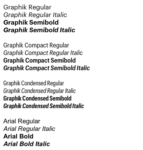
Graphik Regular and Semibold provide a solid foundation for most applications.
Emails and Microsoft PowerPoint® Presentations
Arial Regular and Bold are to be used on all emails and PowerPoint presentations. This is necessary because these instances have inherent technical restraints and/or practical limitations (most of these files are shared with those lacking the Graphik font).
Digital and Charts
Graphik Compact Regular and Semibold are recommended for all digital assets and to show contrast against regular text in print formats. Use it for sidebars, captions, charts or when horizontal space is limited and a narrower column is needed.
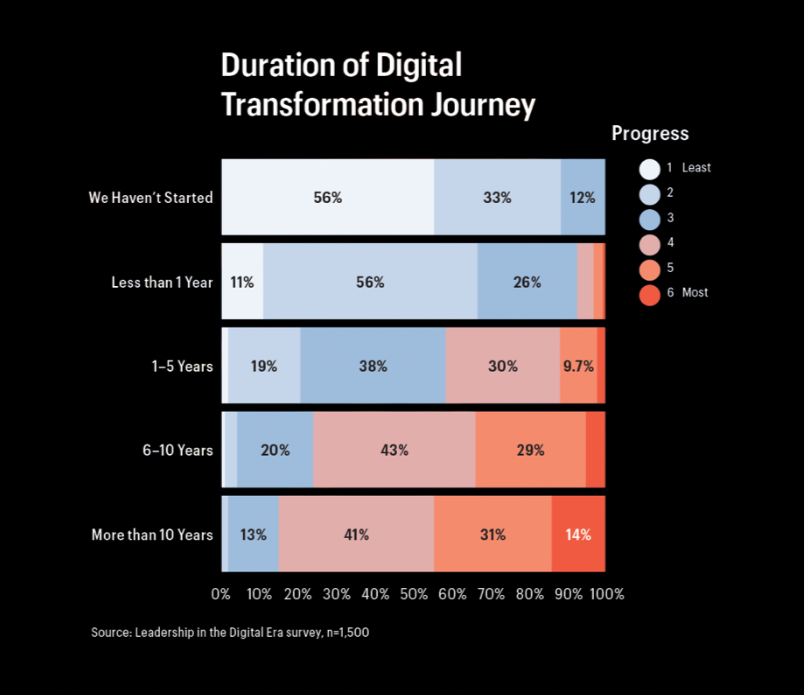
Graphik Condensed Regular and Semibold should primarily be used for large headlines or in charts that require a high density of information in a small space.
Example of chart using condensed font:
Typography—Use Condensed/Compact Fonts for Digital
As stated above, for Digital Assets we change the fonts used to Graphik Condensed and Graphik Compact (to better utilize the restricted space of the deliverables). Below are the two executional choices you have for both digital and print deliverables. The decision of which to use is driven by whether (A) you need to identify statements, programs, or categories with an initial caps treatment, or (B) you have a headline that is a complete sentence.

- Eyebrow Text:
Graphik Compact Medium, all capitals in black or white, 0% tracking. - Rule Under Eyebrow (Preferred):
A 1.5-pt rule is positioned below the eyebrow text. The rule extends the width of the headline or the eyebrow, whichever has the longer line length. - Headline—Initial Caps:
Graphik Condensed SemiBold, initial caps in black, white, or crimson. - Copy:
Graphik Compact Regular, sentence case in black or white.

- Eyebrow Text:
Graphik Medium, all capitals in black, white, or crimson, 0% tracking. - Rule Under Eyebrow (Preferred):
A 1-pt rule positioned below the subhead. The rule extends the width of the headline or the eyebrow, whichever has the longer line length. - Headlines—Initial Caps:
Graphik SemiBold, initial caps in black, white, or crimson. - Copy:
Graphik Regular, sentence case in black or white.

- Eyebrow Text:
Graphik Compact Medium, all capitals in black or white, 0% tracking. - NO Rule Under Eyebrow (Optional):
In dynamic situations where the Eyebrow Rule could possibly deviate from matching the line-length of the Headline (ie, emails, presentations), it is acceptable to delete the underline. - Headline—Sentence:
Graphik Condensed SemiBold, sentence case with punctuation in black, white, or crimson. - Copy:
Graphik Compact Regular, sentence case in black or white.

- Eyebrow Text:
Graphik Medium, all capitals in black, white, or crimson, 0% tracking. - NO Rule Under Eyebrow (Optional):
In dynamic situations where the Eyebrow Rule could possibly deviate from matching the line-length of the Headline (ie, emails, presentations), it is acceptable to delete the underline. - Headline—Sentence:
Graphik SemiBold, sentence case with punctuation in black, white, or crimson. - Copy:
Graphik Regular, sentence case in black or white.
Typography – Date and Time Treatment
Date in Body Copy
Dates in body copy text should use sentence case and spell out day and month completely.
- Example:
Wednesday, July 28, 2022
Date in All Other Situations (Besides Body Copy)
Dates that are not in body copy text use the following formats. Note: Whenever a dash is used between dates, it needs to be an en-dash (Opt + Dash).
- Day/Month/Year format
DD MMM YYYY - One day example:
28 JUL 2022 - Multi-day example (Same Month):
26–28 JUL 2022 - Multi-day example (spanning months):
27 MAR–01 APR 2022 - For programs held on a specific day:
THU, 27 JAN 2022
Time in Body Copy
Time in body copy text should use sentence case and punctuation.
- Example:
Classes are held from 11:00 a.m. to 1:00 p.m.
Time in All Other Situations (Besides Body Copy)
Times in all other situations are set in ALL-CAPS, no periods with times separated by an en-dash (Opt + Dash).
- Example:
11:00 AM–1:00 PM
Typography and Accessibility (Federal ADA Compliance)
Harvard University is legally obliged to meet AA WCAG 2.1 accessibility standards. It is of the utmost importance to use fonts with the most readable colors and sizes permitted with each background color. For these guidelines, see the Color Palette page.
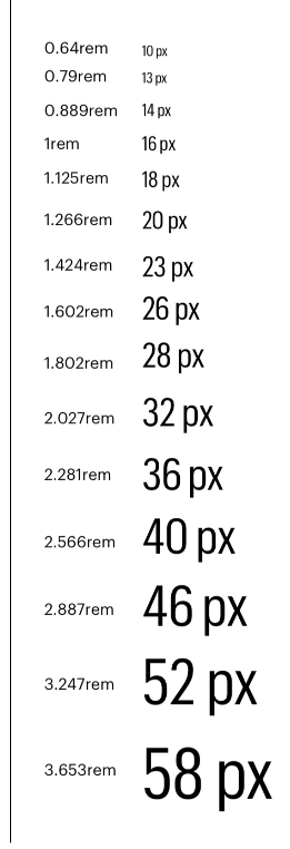
Major Second Type Scale (1.125)
We use a medium scale to establish a clear hierarchy, and help to organize sections with subheads/eyebrows. A medium scale is versatile and works well for both digital and print executions.
Leading
The space between lines of copy should be at least +2 of the type size (ie, a 16px font would have at least 18px leading). It is preferred to use more leading when space allows, such as in print or web pages.
Typography – Application
Regardless of the application, HBS font styles (ie; regular, semibold, and compact) need to be applied consistently across all forms of communication. Use HBS templates for all new work. This is due to the fact that type sizes can vary per application (based on physical size and content load), the template files contain the full range of typographic treatments required.
NOTE: For print/pdf files, only use paragraph styles (not character styles), this is necessary to create a proper file for the accessibility process.
Print/PDF

| Eyebrow | Graphik Compact | Semibold; ALL CAPS | 9 pt |
| Headline | Graphik | Semibold; Initial Caps | 28 pt |
| Body Copy | Graphik | Regular; Sentence case. | 9.5 pt (No Less Than 8.5) |
| Subhead | Graphik Compact | Semibold; ALL CAPS | 9 pt |
| Quotes and Call-outs | Graphik Compact | Semibold; Sentence case with punctuation | 13 pt |
Digital Banners

| Eyebrow | Graphik Compact | Medium; ALL CAPS | 10-18 pt (Size Dependent) |
| Headline | Graphik Condensed | Semibold; Initial Caps | 23-46 pt (Size Dependent) |
| Body Copy | Graphik Compact | Regular; Sentence case with punctuation | 10-18 pt (Size Dependent) |
Social

| Eyebrow | Graphik Compact | Medium; ALL CAPS | 28-36 pt (Size Dependent) |
| Headline | Graphik Condensed | Semibold; Initial Caps | 58-82 pt (Size Dependent) |
PowerPoint

| Eyebrow | Arial | Regular; ALL CAPS | 8 pt |
| Headline | Arial | Bold; Initial Caps | 23 pt |
| Body Copy | Arial | Regular; Sentence case. | 12 pt (No Less Than 10) |
| Subhead | Arial | Bold; ALL CAPS | 12 pt |
| Quotes and Call-outs | Arial | Bold; Sentence case with punctuation. | 12 pt |
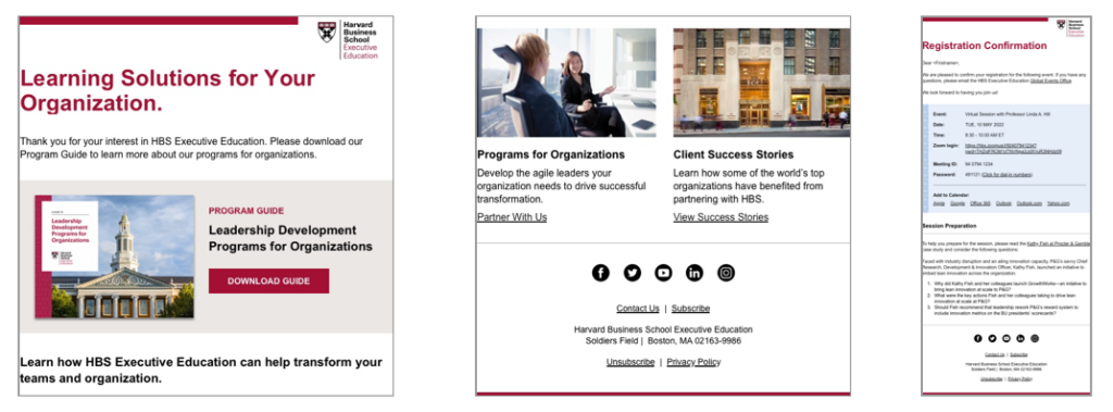
| Eyebrow | Arial | Regular; ALL CAPS | 14 pt |
| Headline | Arial | Bold; Initial Caps | 36 pt |
| Body Copy | Arial | Regular; Sentence case. | 16 pt (No Less Than 14) |
| Subhead | Arial | Bold; ALL CAPS | 18 pt |
| Quotes and Call-outs | Arial | Bold; Sentence case with punctuation | 18 pt |
