Blocks are repeatable components used to create page content. Browse content by block types, view component compatibility, or view alignment options
Block Types
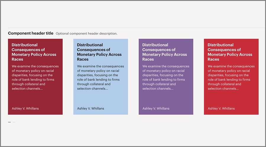
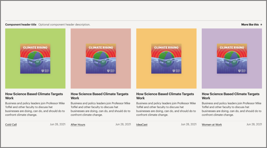
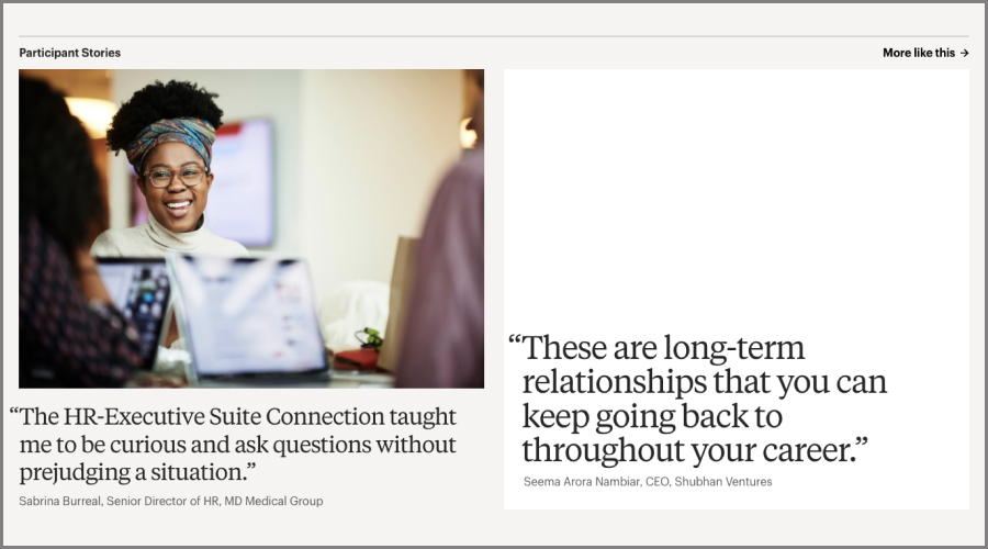
Article Tease Blocks
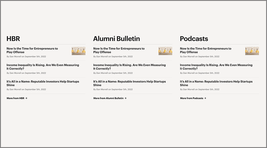
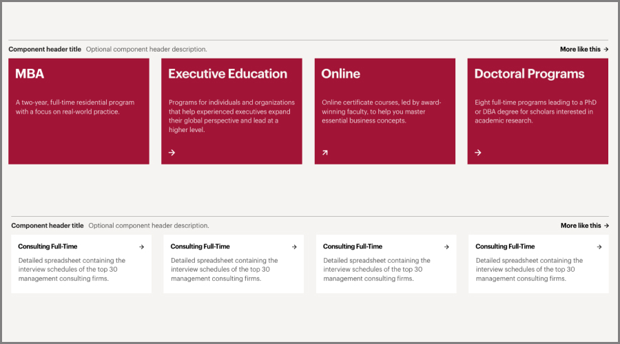
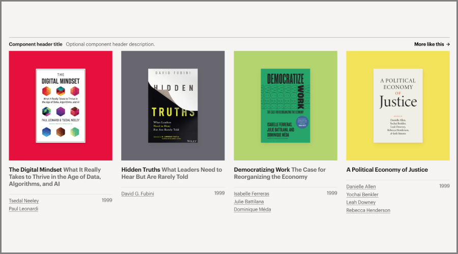
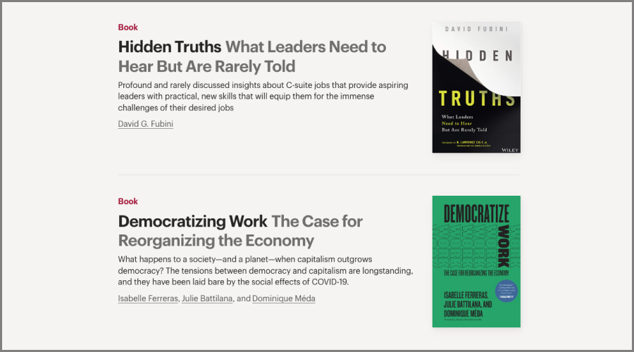
Content Tease Blocks

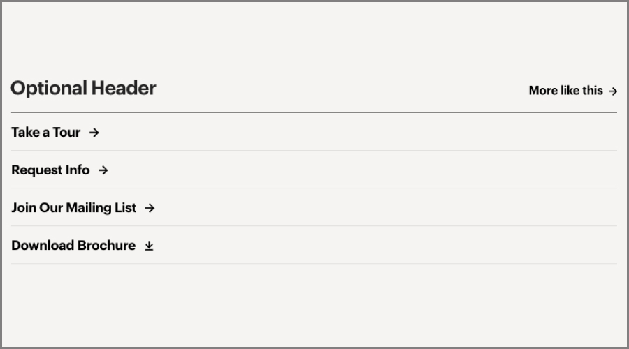
CTA Blocks


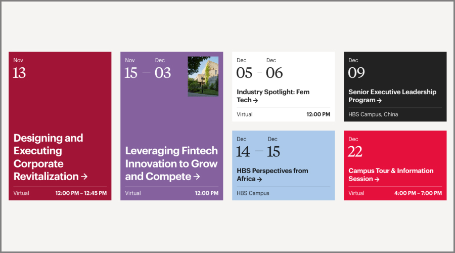
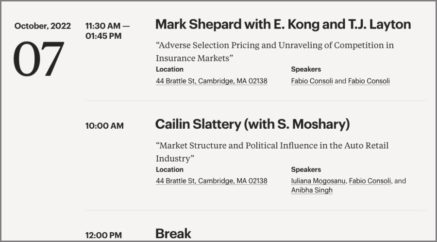
Event Blocks

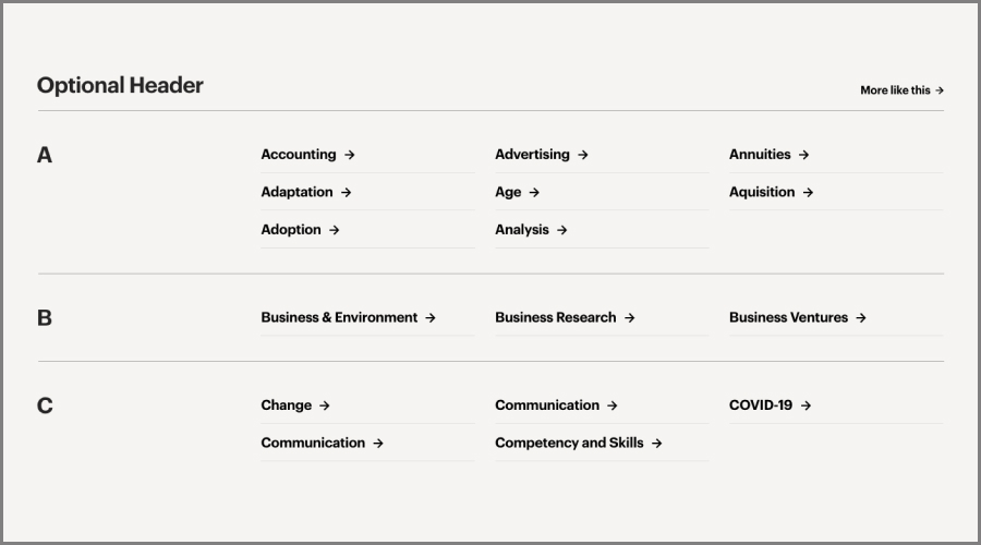
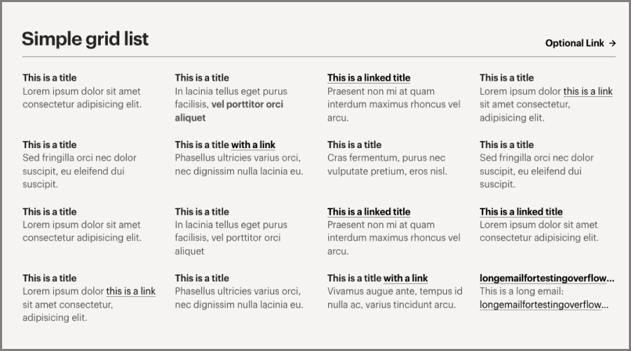
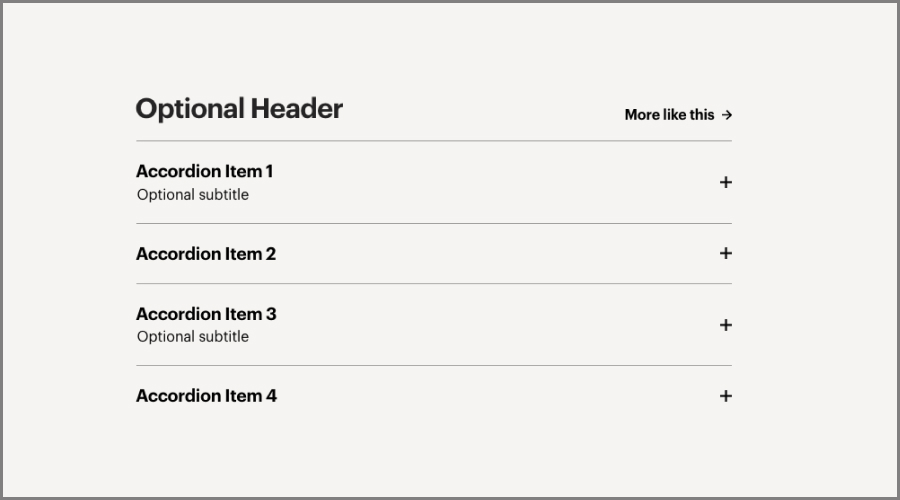
List Blocks


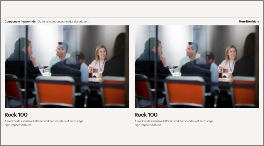
Media Blocks

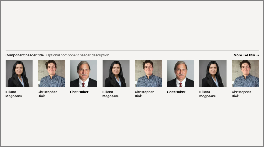
People Blocks

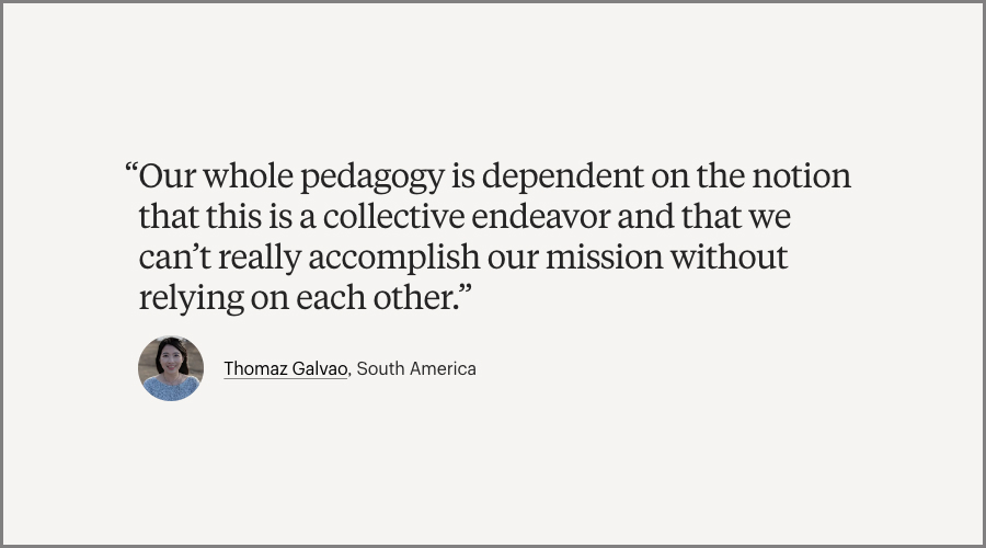
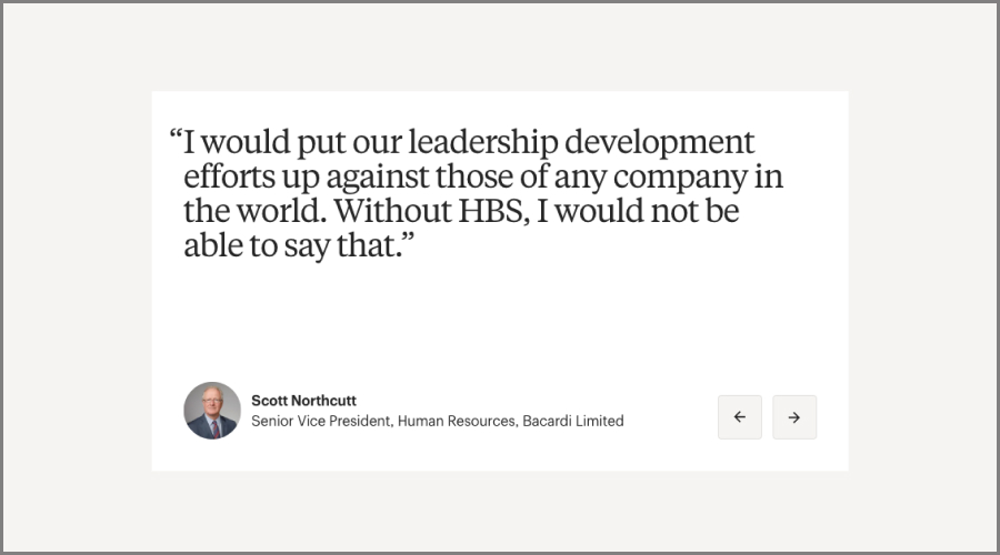
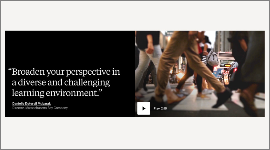
Quote Blocks
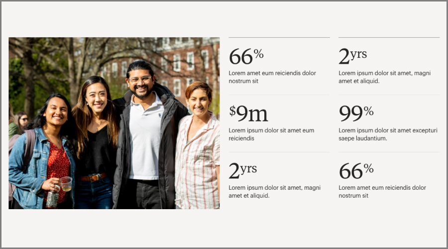
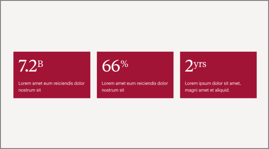
Statistic Blocks
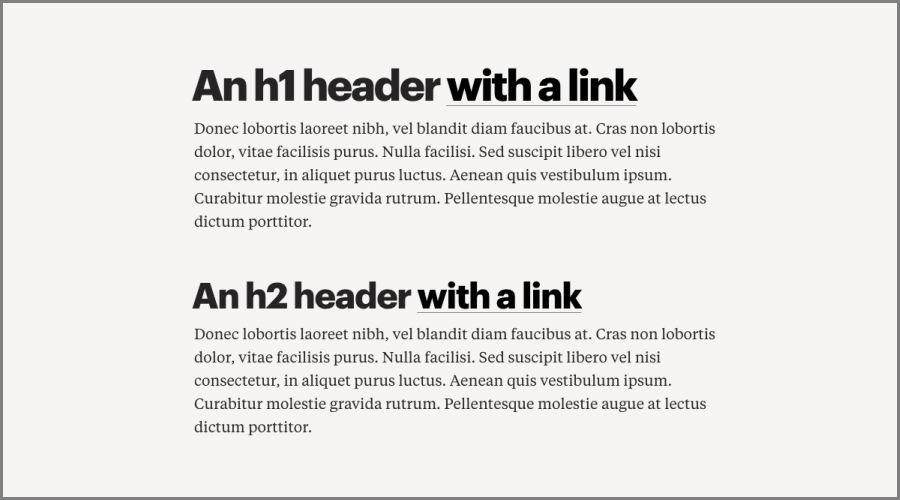
Text Blocks

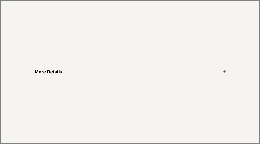
Truncation Blocks
Content Block Template Compatibility
| Component | Archive Page | Landing Page | Detail Page | Article Page |
|---|---|---|---|---|
| Accordion | ⚫️ | ⚫️ | ⚫️ | |
| CTA Banner | ⚫️ | ⚫️ | ⚫️ | |
| Event Schedule | ⚫️ | ⚫️ | ⚫️ | |
| Events Tease | ⚫️ | ⚫️ | ⚫️ | |
| Grid List — Big | ⚫️ | ⚫️ | ⚫️ | |
| Grid List — Small | ⚫️ | ⚫️ | ⚫️ | |
| Hero Statement | ⚫️ | |||
| Hero Tease | ⚫️ | |||
| Hierarchical Tease | ⚫️ | |||
| Media Asset Row | ⚫️ | ⚫️ | ⚫️ | |
| Media Carousel | ⚫️ | |||
| Multi-Column Rich Text | ⚫️ | ⚫️ | ⚫️ | |
| Multi Feed Tease Row | ⚫️ | |||
| Multiple Column List | ⚫️ | ⚫️ | ⚫️ | |
| People Listing | ⚫️ | ⚫️ | ||
| Podcast Player | ⚫️ | ⚫️ | ⚫️ | |
| Pull Quote | ⚫️ | ⚫️ | ⚫️ | |
| Quote Testimonial | ⚫️ | ⚫️ | ⚫️ | |
| Rich Text | ⚫️ | ⚫️ | ⚫️ | |
| Section Intro Text | ⚫️ | |||
| Side-By-Side List | ⚫️ | |||
| Side-By-Side Section Intro | ⚫️ | |||
| Statistics Group | ⚫️ | ⚫️ | ⚫️ | |
| Statistics Row | ⚫️ | ⚫️ | ⚫️ | |
| Supporting Details | ⚫️ | |||
| Table | ⚫️ | ⚫️ | ⚫️ | |
| Tease Carousel | ⚫️ | |||
| Tease Feed | ⚫️ | ⚫️ | ⚫️ | ⚫️ |
| Tease Row | ⚫️ | ⚫️ | ⚫️ | |
| Text Callout | ⚫️ | ⚫️ | ⚫️ | |
| Timeline Tease | ⚫️ | ⚫️ | ⚫️ | |
| Truncator | ⚫️ | ⚫️ | ⚫️ |
Content Block Alignment Options
| Component | Center | Wide | Full |
|---|---|---|---|
| Accordion | ⚫️ | ⚫️ | ⚫️ |
| CTA Banner | ⚫️ | ⚫️ | ⚫️ |
| Event Schedule | ⚫️ | ||
| Events Tease | ⚫️ | ⚫️ | ⚫️ |
| Grid List — Big | ⚫️ | ⚫️ | |
| Grid List — Small | ⚫️ | ⚫️ | ⚫️ |
| Hero Statement | ⚫️ | ||
| Hero Tease | ⚫️ | ||
| Hierarchical Tease | ⚫️ | ||
| Media Asset Row | ⚫️ | ⚫️ | ⚫️ |
| Media Carousel | ⚫️ | ||
| Multi-Column Rich Text | ⚫️ | ⚫️ | |
| Multi Feed Tease Row | ⚫️ | ||
| Multiple Column List | ⚫️ | ⚫️ | ⚫️ |
| People Listing | ⚫️ | ⚫️ | |
| Podcast Player | ⚫️ | ⚫️ | ⚫️ |
| Pull Quote | ⚫️ | ⚫️ | ⚫️ |
| Quote Testimonial | ⚫️ | ⚫️ | |
| Rich Text | ⚫️ | ||
| Section Intro Text | ⚫️ | ||
| Side-By-Side List | ⚫️ | ||
| Side-By-Side Section Intro | ⚫️ | ||
| Statistics Group | ⚫️ | ⚫️ | ⚫️ |
| Statistics Row | ⚫️ | ⚫️ | ⚫️ |
| Supporting Details | ⚫️ | ||
| Table | ⚫️ | ⚫️ | ⚫️ |
| Tease Carousel | ⚫️ | ||
| Tease Feed | ⚫️ | ⚫️ | ⚫️ |
| Tease Row | ⚫️ | ⚫️ | ⚫️ |
| Text Callout | ⚫️ | ⚫️ | ⚫️ |
| Timeline Tease | ⚫️ | ⚫️ | ⚫️ |
| Truncator | ⚫️ | ⚫️ | ⚫️ |