Content Components are used by content creators to build pages. They make up most of the HBS Design System and are used to present almost any type of content to site visitors.
-
Toppers
Toppers are singleton components required to start pages.
-
Blocks
Blocks are repeatable components used to create page content.
-
Template-Specific Singletons
Template-Specific Singletons are components optionally used once on specific templates.
Toppers
Toppers are singleton components required to start pages.
-
Page Toppers
Page toppers are required to start pages.
-
Article Toppers
Article toppers are required to start news articles, stories, and blog posts.
-
Template Toppers
Template toppers are required to start pages with specific templates.
| Template Compatibility | Archive Page | Landing Page | Detail Page | Article Page |
|---|---|---|---|---|
| Page Topper (all) | ⚫️ | ⚫️ | ⚫️ | |
| Article Topper (all) | ⚫️ | |||
| Course Topper | ⚫️ | ⚫️ | ⚫️ | |
| Editorial Topper | ⚫️ | ⚫️ | ⚫️ | |
| Event Topper | ⚫️ | ⚫️ | ⚫️ | |
| Participant Story Topper | ⚫️ | |||
| Profile Topper | ⚫️ | ⚫️ | ⚫️ | |
| Search Topper | ⚫️ |
Blocks
Blocks are repeatable components used to create page content.
-
Accordion
The Accordion component allows users to hide or reveal content.
-
CTA Banner
The CTA Banner component displays one or more prominent links.
-
Event Schedule
The Event Schedule component displays events in date order.
-
Events Tease
The Events Tease component highlights two to six events.
-
Grid List
The Grid List component displays multiple items of text in a visual grid.
-
Hero Statement
The Hero Statement component features a large message with one or more links and a large accompanying image or video.
-
Hero Tease
The Hero Tease component presents a large visual format to tease an HBS story or other editorial piece.
-
Hierarchical Tease
The Hierarchical Tease component presents multiple HBS stories or other editorial pieces.
-
Media Asset Row
The Media Asset Row component presents one to three media assets, such as images.
-
Media Carousel
The Media Carousel component presents three or more media assets in a horizontally-advancing slideshow.
-
Multi-Column Rich Text
The Multi-Column Rich Text component displays a two-column narrative text with rich formatting options.
-
Multi-Feed Tease Row
The Multi-Feed Tease Row component features multiple lists of articles, each with a title and CTA link for more.
-
Multiple Column List
The Multiple Column List component displays a group of links under a common title and subtitle.
-
People Listing
The People Listing component displays a list of people with or without bios using the Person Tease primitive.
-
Podcast Player
The Podcast Player component is used to embed podcast audio on a page.
-
Pull Quote
The Pull Quote component highlights an excerpt or quote with optional attribution.
-
Quote Testimonial
The Quote Testimonial component highlights a quote with one to three accompanying media assets.
-
Rich Text
The Rich Text component displays a single-column narrative text with rich formatting options and optional embedded images.
-
Section Intro Text
The Section Intro Text component displays multi-column narrative text and optional image under an introduction.
-
Side-By-Side List
The Side-By-Side List component displays a variety of links and numerical statistics in a column layout with titles and subtitles.
-
Side-By-Side Section Intro
The Side-By-Side Section Intro component displays a title, narrative text, optional subtitle, and optional order number.
-
Statistics Group
The Statistics Group component displays a list of numerical statistics with optional image and CTA link.
-
Statistics Row
The Statistics Row component displays a list of numerical statistics on cards.
-
Supporting Details
The Supporting Details component displays a list of related text items with accompanying image.
-
Table
The Table component displays tabular data in a column-and-row grid layout.
-
Tease Carousel
The Tease Carousel component highlights multiple links or stories in a color horizontally-scrolling layout.
-
Tease Feed
The Tease Feed component lists articles, books, or events in a vertical scrolling layout.
-
Tease Row
The Tease Row component lists articles, books, links, videos, or people in a horizontal layout.
-
Text Callout
The Text Callout component highlights one or more pieces of information on a page.
-
Timeline Tease
The Timeline Tease component displays events on a date or a range of dates.
-
Truncator
The Truncator component allows users to reveal or hide content. This is useful for reducing cognitive load for large sections of content.
Content Block Template Compatibility
| Component | Archive Page | Landing Page | Detail Page | Article Page |
|---|---|---|---|---|
| Accordion | ⚫️ | ⚫️ | ⚫️ | |
| CTA Banner | ⚫️ | ⚫️ | ⚫️ | |
| Event Schedule | ⚫️ | ⚫️ | ⚫️ | |
| Events Tease | ⚫️ | ⚫️ | ⚫️ | |
| Grid List — Big | ⚫️ | ⚫️ | ⚫️ | |
| Grid List — Small | ⚫️ | ⚫️ | ⚫️ | |
| Hero Statement | ⚫️ | |||
| Hero Tease | ⚫️ | |||
| Hierarchical Tease | ⚫️ | |||
| Media Asset Row | ⚫️ | ⚫️ | ⚫️ | |
| Media Carousel | ⚫️ | |||
| Multi-Column Rich Text | ⚫️ | ⚫️ | ⚫️ | |
| Multi Feed Tease Row | ⚫️ | |||
| Multiple Column List | ⚫️ | ⚫️ | ⚫️ | |
| People Listing | ⚫️ | ⚫️ | ||
| Podcast Player | ⚫️ | ⚫️ | ⚫️ | |
| Pull Quote | ⚫️ | ⚫️ | ⚫️ | |
| Quote Testimonial | ⚫️ | ⚫️ | ⚫️ | |
| Rich Text | ⚫️ | ⚫️ | ⚫️ | |
| Section Intro Text | ⚫️ | |||
| Side-By-Side List | ⚫️ | |||
| Side-By-Side Section Intro | ⚫️ | |||
| Statistics Group | ⚫️ | ⚫️ | ⚫️ | |
| Statistics Row | ⚫️ | ⚫️ | ⚫️ | |
| Supporting Details | ⚫️ | |||
| Table | ⚫️ | ⚫️ | ⚫️ | |
| Tease Carousel | ⚫️ | |||
| Tease Feed | ⚫️ | ⚫️ | ⚫️ | ⚫️ |
| Tease Row | ⚫️ | ⚫️ | ⚫️ | |
| Text Callout | ⚫️ | ⚫️ | ⚫️ | |
| Timeline Tease | ⚫️ | ⚫️ | ⚫️ | |
| Truncator | ⚫️ | ⚫️ | ⚫️ |
Content Block Alignment Options
| Component | Center | Wide | Full |
|---|---|---|---|
| Accordion | ⚫️ | ⚫️ | ⚫️ |
| CTA Banner | ⚫️ | ⚫️ | ⚫️ |
| Event Schedule | ⚫️ | ||
| Events Tease | ⚫️ | ⚫️ | ⚫️ |
| Grid List — Big | ⚫️ | ⚫️ | |
| Grid List — Small | ⚫️ | ⚫️ | ⚫️ |
| Hero Statement | ⚫️ | ||
| Hero Tease | ⚫️ | ||
| Hierarchical Tease | ⚫️ | ||
| Media Asset Row | ⚫️ | ⚫️ | ⚫️ |
| Media Carousel | ⚫️ | ||
| Multi-Column Rich Text | ⚫️ | ⚫️ | |
| Multi Feed Tease Row | ⚫️ | ||
| Multiple Column List | ⚫️ | ⚫️ | ⚫️ |
| People Listing | ⚫️ | ⚫️ | |
| Podcast Player | ⚫️ | ⚫️ | ⚫️ |
| Pull Quote | ⚫️ | ⚫️ | ⚫️ |
| Quote Testimonial | ⚫️ | ⚫️ | |
| Rich Text | ⚫️ | ||
| Section Intro Text | ⚫️ | ||
| Side-By-Side List | ⚫️ | ||
| Side-By-Side Section Intro | ⚫️ | ||
| Statistics Group | ⚫️ | ⚫️ | ⚫️ |
| Statistics Row | ⚫️ | ⚫️ | ⚫️ |
| Supporting Details | ⚫️ | ||
| Table | ⚫️ | ⚫️ | ⚫️ |
| Tease Carousel | ⚫️ | ||
| Tease Feed | ⚫️ | ⚫️ | ⚫️ |
| Tease Row | ⚫️ | ⚫️ | ⚫️ |
| Text Callout | ⚫️ | ⚫️ | ⚫️ |
| Timeline Tease | ⚫️ | ⚫️ | ⚫️ |
| Truncator | ⚫️ | ⚫️ | ⚫️ |
Template-Specific Singletons
Template-Specific Singletons are components optionally used once on specific templates.
Article Singletons
-
Related People
The Related People component provides information on people mentioned in an article.
-
Article Footer
The Article Footer component provides a standard collection of article credits, keywords, and topic links.
| Template Compatibility | Archive Page | Landing Page | Detail Page | Article Page |
|---|---|---|---|---|
| Article Footer | ⚫️ | |||
| Related People | ⚫️ | ⚫️ |
Image Aspect Ratios
Component-Specific Guidelines
Recommended aspect ratios for each component that allow image use are provided below.
Toppers
| Component | Aspect Ratio (recommended) | Width (proportional) | Height (proportional) | Scaling Behavior |
|---|---|---|---|---|
| Card Topper | 3:2 | Fixed* (*Images will auto-crop based on the limiting dimension—see next section for details) | Fixed* | Scales down proportionately on mobile—does not crop. |
| Media Page Topper | 1 asset – 16:9 2 assets – 3:2 x 2 3 assets: 3:2, 3:4 & 3:2 | 1 asset – 16:9 Fixed 2 assets – 3:2 Fixed 3 assets – 3:4 Fixed; 3:2 Crops uniformly left and right | Fixed | 1 asset – Scales down proportionately on mobile—does not crop. 2 assets – Height is fixed; width will crop (uniformly left and right) on mobile. 3 assets – 3:4 images scale down proportionally – will not crop on mobile; 3:2 images height is fixed but width will crop (uniformly left and right) on mobile. |
| Split Page Topper | 3:4 | Crops uniformly left and right | Fixed | Height is fixed; width will crop (uniformly left and right) on mobile. |
| Statistics Page Topper | 3:2 | Crops uniformly left and right | Fixed | Height is fixed; width will crop (uniformly left and right) on mobile. Photo will go to square or slightly vertical on tablet and revert to horizontal on phone. |
| Split Article Topper | 3:4 | Crops uniformly left and right | Fixed | Height is fixed; width will crop (uniformly left and right) on mobile. Will appear horizontal on desktop, vertical on tablet, and square-ish to slightly vertical on phone. |
| Big Art Topper | 16:9 | Fixed* | Fixed* | Scales down proportionately on mobile—does not crop. |
| Profile Topper | 3:4 (See Notes) | Fixed* | Fixed* | 3:4 image will always crop top and bottom to just short of square (remains slightly vertical). Scales down proportionately on mobile—does not crop. |
Blocks
| Component | Aspect Ratio (recommended) | Width (proportional) | Height (proportional) | Scaling Behavior |
|---|---|---|---|---|
| CTA Banner | 1 asset – 3:2 2 assets (mismatched heights) – 3:4 & 3:2 2 assets (same heights) – 3:4 x 2 3 assets – 3:4 x 3 | 1 asset – 3:2 Fixed (Photo); 3:2 Not Fixed (Video)* 2 assets (mismatched heights) – Fixed* 2 assets (equal heights) – 3:4 (See Notes) 3 assets – 3:4 Crops uniformly left and right | 1 asset- 3:2 Fixed* 2 assets (mismatched heights) – Fixed* 2 assets (equal heights) – 3:4 (See Notes) 3 assets (See Notes) | 1 asset – Scales down proportionately on mobile—does not crop. 2 assets (mismatched heights) – Scales down proportionately on mobile—does not crop. 2 assets (equal heights) – As width first narrows, height is fixed and images crop left and right equally. At ~narrow tablet width, breaks to one (first) image and width is fixed and crops uniformly top and bottom. 3 assets – As width first narrows, height is fixed and images crop left and right equally. At ~tablet width, breaks to (first) two images: height is fixed and width crops uniformly left and right (slightly more width shows on left and right of images than in 3 image view.) At ~narrow tablet width, breaks to one (first) image: crops all sides – left and right uniformly; top and bottom uniformly. |
| Events Tease | 3:4 | Fixed* | Fixed* | Scales down proportionately on mobile—does not crop. |
| Grid List – Big | 3:4 | N/A | N/A | Scales proportionally down to tablet. No image on phone view. |
| Hero Statement | 3:2 | Fixed* | Fixed* | Text block covers increasing amount of lower-left section of image as browser width decreases. |
| Hero Tease | 3:2 | Fixed* | Fixed* | Text block covers increasing amount of lower-left section of image as browser width decreases. |
| Hierarchical Tease | 3:2 | Fixed* | Fixed* | Scales down proportionately on mobile. |
| Media Asset Row | Any | Fixed* | Fixed* | Scales down proportionally on mobile. |
| Media Carousel | 3:2 | Fixed* | Fixed* | Scales down proportionally on mobile. |
| Multiple Column List | 3:2 | Crops uniformly left and right | Fixed | Height is fixed; width will crop (uniformly left and right) on mobile. Image goes from horizontal to vertical appearance at narrow widths. |
| Quote Testimonial | 3:2 | Crops very slightly left and right (uniformly). | Fixed | Height is fixed. Width crops very slightly (uniformly) as browser narrows. |
| Section Intro Text | 3:4 or 4:3 (3:4 more ideal) | Fixed* | Fixed* | Scales down proportionately on mobile—does not crop. |
| Statistics Group | 3:2 | Crops uniformly left and right | Fixed | Height is fixed; width will crop (uniformly left and right) on mobile. Image goes from horizontal to vertical appearance on phone. |
| Supporting Details | 3:4 or 4:3 (3:4 more ideal) | Fixed* | Fixed* | Scales down proportionately on mobile—does not crop. |
| Tease Feed | 3:2 | Fixed* | Fixed* | Scales down proportionately on mobile—does not crop. |
| Tease Row – Article | 3:2 | Fixed* | Fixed* | Scales down proportionately on mobile—does not crop. |
| Tease Row – Content | 3:2 | Fixed* | Fixed* | Scales down proportionately on mobile—does not crop. |
| Tease Row – Person | 1:1 | Fixed* | Fixed* | Scales down proportionately on mobile—does not crop. |
| Tease Row – Book | Use original book cover aspect ratio for images. | Fixed* | Fixed* | Scales down proportionately on mobile—does not crop. |
| Timeline Tease | 3:2 | Fixed* | Fixed* | Scales down proportionately on mobile – does not crop. |
Template-Specific Singletons
| Component | Aspect Ratio (recommended) | Width (proportional) | Height (proportional) | Scaling Behavior |
|---|---|---|---|---|
| Article Footer | 1:1 | Fixed* | Fixed* | Crops to circular frame. |
| Related People | 1:1 | Fixed* | Fixed* | Crops to circular frame. |
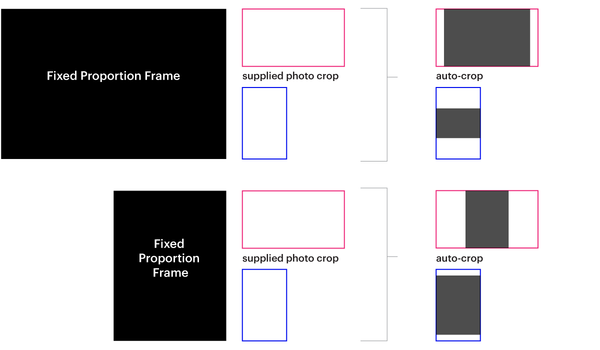
How Photos Auto-Crop in Fixed Proportion Footprints
In fixed proportion image footprints (i.e., both width and height scale down proportionally on mobile), the posted image will be auto-cropped based on the limiting dimension: